Fig. 5
Download original image
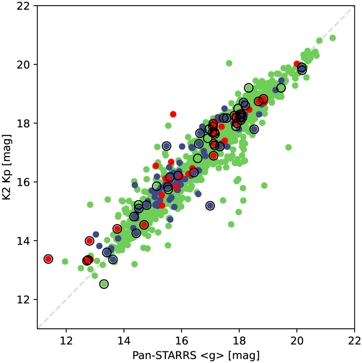
Brightness comparison of the sample. Pan-STARRS g magnitudes are shown on the horizontal axis, while Kepler Kp magnitudes are plotted for each star on the vertical axis. The green dots denote stars that have the same frequency from both K2 and Pan-STARRS data, the blue dots are stars that have an alias of 1 or 2 d−1 in their Pan-STARRS frequencies, and red dots mark the stars for which there is a different discrepancy in the periods. Black circles mark the stars that we found to be misclassified in the Sesar et al. (2017) catalogue.
Current usage metrics show cumulative count of Article Views (full-text article views including HTML views, PDF and ePub downloads, according to the available data) and Abstracts Views on Vision4Press platform.
Data correspond to usage on the plateform after 2015. The current usage metrics is available 48-96 hours after online publication and is updated daily on week days.
Initial download of the metrics may take a while.