Fig. 8.
Download original image
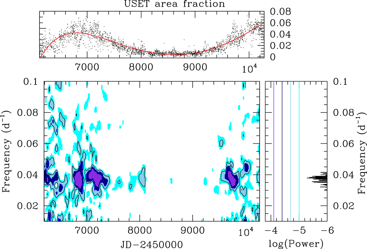
Time-frequency diagram of the APEN time series. The top panel displays the observed data along with the red curve providing the fit by a polynomial to the long-term variations based on a degree of 6. The color-scale image provides the evolution of the Fourier power spectrum with the epoch on the x-axis. Violet, dark blue, light blue, and cyan colors stand for power ≥8 × 10⁻⁵, ≥4 × 10⁻⁵, ≥2 × 10⁻⁵, and ≥10−5. The right vertical panel illustrates the Fourier power spectrum evaluated over the full duration of the USET time series. The colored straight lines correspond to the scale used in the time-frequency diagram.
Current usage metrics show cumulative count of Article Views (full-text article views including HTML views, PDF and ePub downloads, according to the available data) and Abstracts Views on Vision4Press platform.
Data correspond to usage on the plateform after 2015. The current usage metrics is available 48-96 hours after online publication and is updated daily on week days.
Initial download of the metrics may take a while.