Open Access
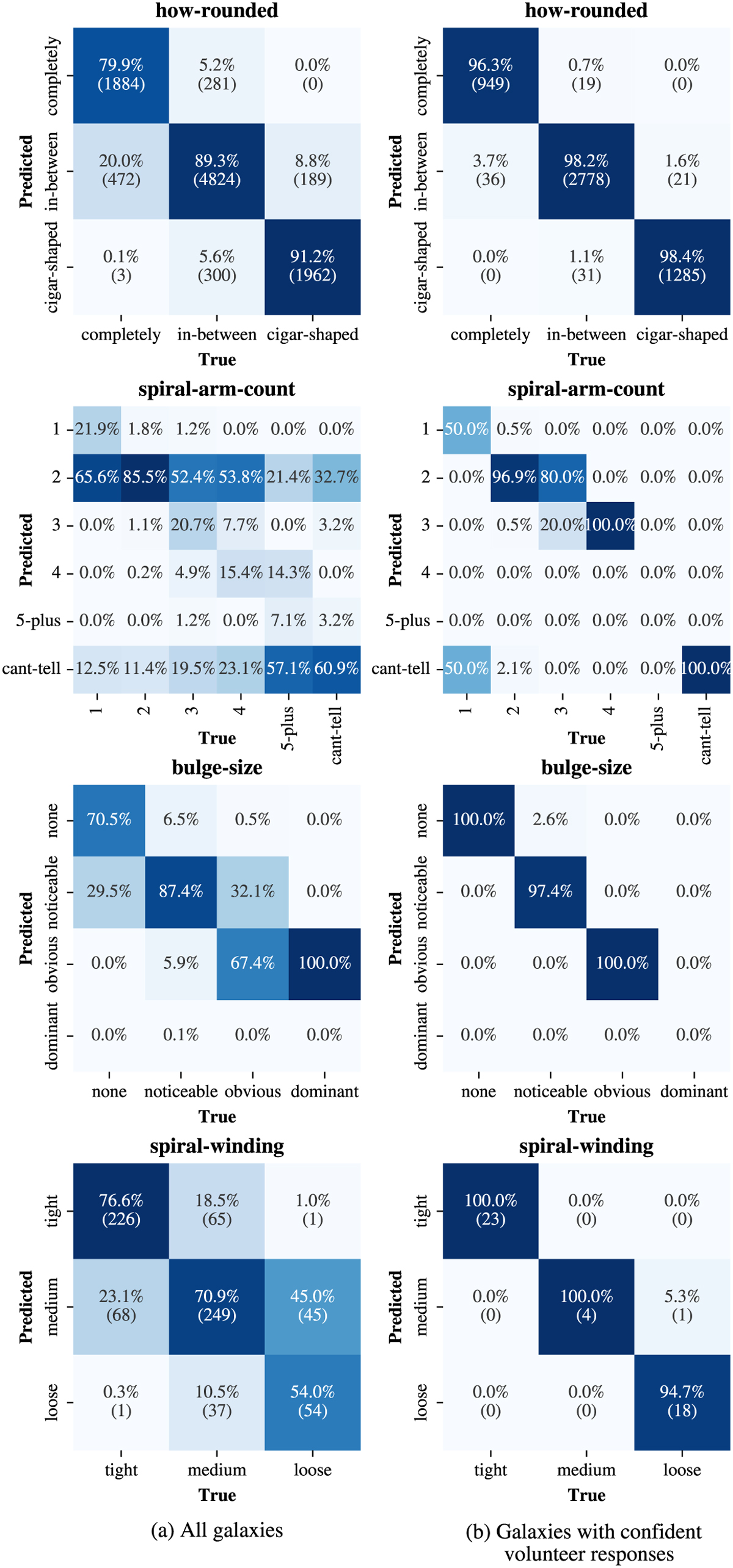
Fig. C.1
Download original image
Confusion matrices continued from Fig. 8 after binning to the class with the highest predicted vote fraction. The colour map corresponds to the fraction of the ground truth values for the different classes. To improve the readability, for the tasks with more than three answers, only the percentage is stated.
This figure is made of several images, please see below:
Current usage metrics show cumulative count of Article Views (full-text article views including HTML views, PDF and ePub downloads, according to the available data) and Abstracts Views on Vision4Press platform.
Data correspond to usage on the plateform after 2015. The current usage metrics is available 48-96 hours after online publication and is updated daily on week days.
Initial download of the metrics may take a while.