Fig. 11
Download original image
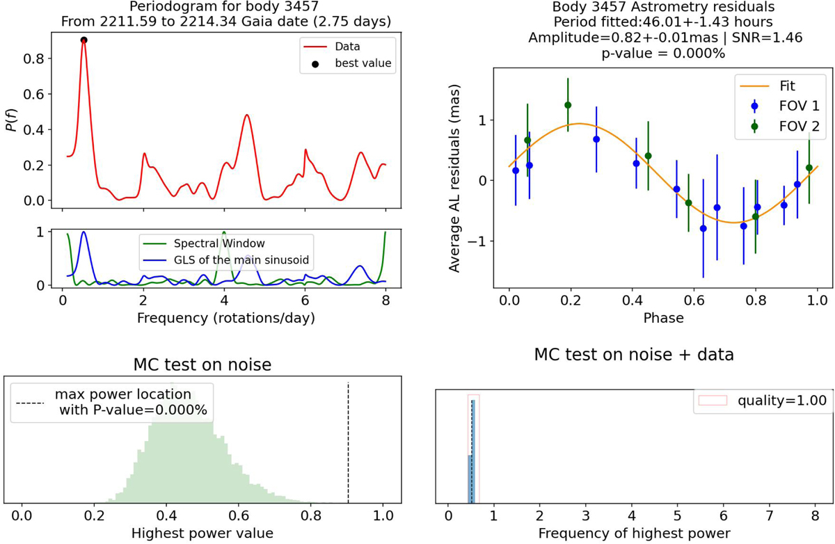
Visualisation of the output of the main steps of the selection process in the period search for one candidate example ((3457) Arnenordheim). The top left plot shows the periodogram from the fitting of the 17 observations in the window. The peak represents a period of 45.95h and the best fit is shown in the phased data in the top right plot. The distribution of data points not phased is shown in the right plot in Fig. 3. The bottom left plot shows the empirical distribution of GLSP power V (maximum value of the GLSP under ℋ0) and the vertical dashed line shows the position of the value of υ, the power of the peak from the periodogram with the real data, with p(υ) < 0.001%. Finally, the bottom right plot shows the distribution of best frequencies from the 5000 MC simulations under ![]() ). The distribution tends to accumulate around the originally estimated frequency, showing that this detection is robust (here Q is close to 1.)
). The distribution tends to accumulate around the originally estimated frequency, showing that this detection is robust (here Q is close to 1.)
Current usage metrics show cumulative count of Article Views (full-text article views including HTML views, PDF and ePub downloads, according to the available data) and Abstracts Views on Vision4Press platform.
Data correspond to usage on the plateform after 2015. The current usage metrics is available 48-96 hours after online publication and is updated daily on week days.
Initial download of the metrics may take a while.