Fig. 20
Download original image
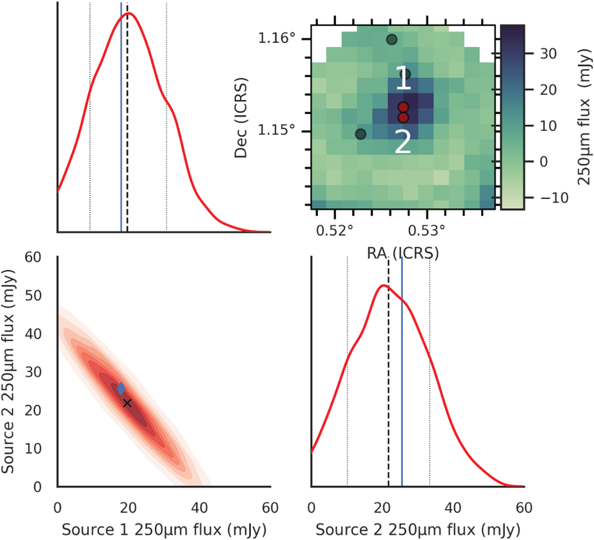
Joint and marginalised posterior plot of two correlated sources (~4″ apart) in the simulated 250 μm maps. Note that the joint and marginalised posteriors have been scaled by a factor of two using Eq. (6). The dashed black lines and the black cross indicate the fluxes extracted by XID+. The solid blue lines and the blue diamond indicate the true fluxes. The vertical dotted lines correspond to the 16th–84th percentiles in the posterior.
Current usage metrics show cumulative count of Article Views (full-text article views including HTML views, PDF and ePub downloads, according to the available data) and Abstracts Views on Vision4Press platform.
Data correspond to usage on the plateform after 2015. The current usage metrics is available 48-96 hours after online publication and is updated daily on week days.
Initial download of the metrics may take a while.