Fig. E.1
Download original image
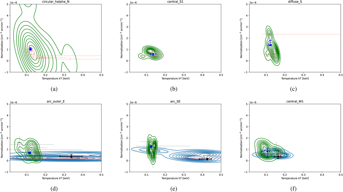
Comparison between the contour bin and manually defined region spectral fits. The contours show the density of the fit values from the contour bins, weighted by the area overlap with the respective manual region. In (a)-(c) we show examples using the simple TBABS × NEI model. The green contours and red markers show the best-fit values with uncertainties of the contour bins. The fit result from the manually defined region is shown with a blue marker. In (d)-(f) we show the TBABS × VAPEC1 +APEC2 model, where the green contours and black markers show the low temperature APEC, and the blue contours and red markers the hotter VAPEC component best-fit values. The fit results from the manually defined region are shown with a blue and black marker.
Current usage metrics show cumulative count of Article Views (full-text article views including HTML views, PDF and ePub downloads, according to the available data) and Abstracts Views on Vision4Press platform.
Data correspond to usage on the plateform after 2015. The current usage metrics is available 48-96 hours after online publication and is updated daily on week days.
Initial download of the metrics may take a while.