Fig. C.2
Download original image
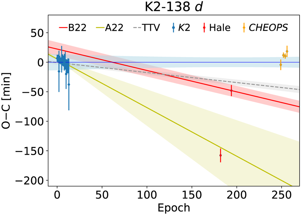
Observed minus calculated (O-C) diagram of the transit times of K2-328 d, compared to our updated ephemeris (light blue region), as described in Sect. 3.3. The times of the transits observed by K2, Hale observatory, and CHEOPS are shown with the blue, red, and orange symbols, respectively. The predicted ephemeris from A22 and B22 are represented with yellow and red curves and regions. The mean ephemeris obtained by the TTV simulations (Sect. 5) is represented by the gray dashed curve.
Current usage metrics show cumulative count of Article Views (full-text article views including HTML views, PDF and ePub downloads, according to the available data) and Abstracts Views on Vision4Press platform.
Data correspond to usage on the plateform after 2015. The current usage metrics is available 48-96 hours after online publication and is updated daily on week days.
Initial download of the metrics may take a while.