Fig. 2.
Download original image
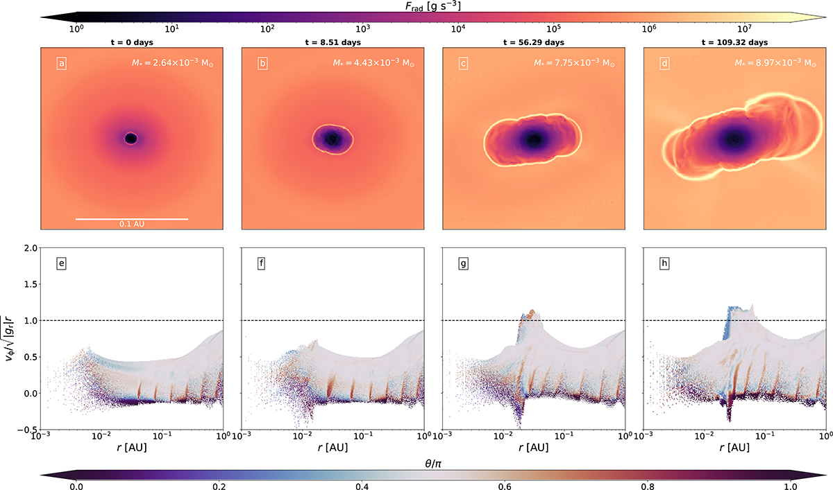
Demonstration of the breakup of the protostar due to excess angular momentum. The data is taken from run G6. Each column represents a different time, where t = 0 marks the birth of the protostar. Panels a–d are slices along the z direction through the center of the domain that display the local radiative flux emanating from the cells (see Eq. (1)). The scale bar in panel a applies to panels b–d as well. The mass of the protostar at each snapshot is displayed in the top-right corners of panels a–d. Panels e–h display 2D histograms binning all the cells in our computational domain, which show the distribution of azimuthal velocities divided by ![]() with respect to radius. The color code in the histograms represents the co-latitude θ divided by π, where θ/π = 0.5 corresponds to the equator and θ/π = 1 (respectively 0) corresponds to the south (respectively north) pole. The dotted black lines in panels e–h display vϕ/vcrit = 1 (see Eq. (2)). An animated version of this plot is available online.
with respect to radius. The color code in the histograms represents the co-latitude θ divided by π, where θ/π = 0.5 corresponds to the equator and θ/π = 1 (respectively 0) corresponds to the south (respectively north) pole. The dotted black lines in panels e–h display vϕ/vcrit = 1 (see Eq. (2)). An animated version of this plot is available online.
Current usage metrics show cumulative count of Article Views (full-text article views including HTML views, PDF and ePub downloads, according to the available data) and Abstracts Views on Vision4Press platform.
Data correspond to usage on the plateform after 2015. The current usage metrics is available 48-96 hours after online publication and is updated daily on week days.
Initial download of the metrics may take a while.