Fig. 2
Download original image
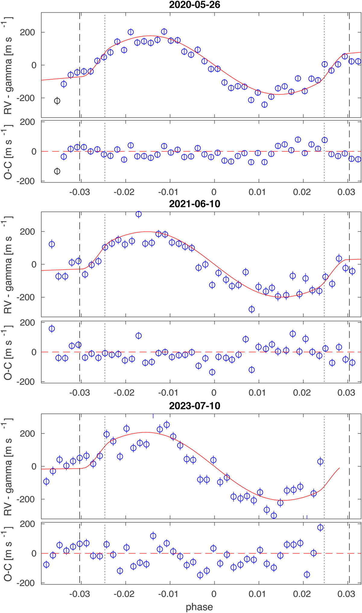
Rossiter-McLaughlin effect analysis. Top: RV time series taken during the transit on 2020 May 26 (N1). The best-fit model is superimposed, and the corresponding residuals are shown in the lower panel. The dashed black lines indicate the points of the first and fourth contact of the transit, while the dotted black lines represent the points of the second and third contact. Middle: same but for the transit on 2021 June 10 (N3). Bottom: same but for the transit on 2023 July 10 (N4).
Current usage metrics show cumulative count of Article Views (full-text article views including HTML views, PDF and ePub downloads, according to the available data) and Abstracts Views on Vision4Press platform.
Data correspond to usage on the plateform after 2015. The current usage metrics is available 48-96 hours after online publication and is updated daily on week days.
Initial download of the metrics may take a while.