Fig. 1
Download original image
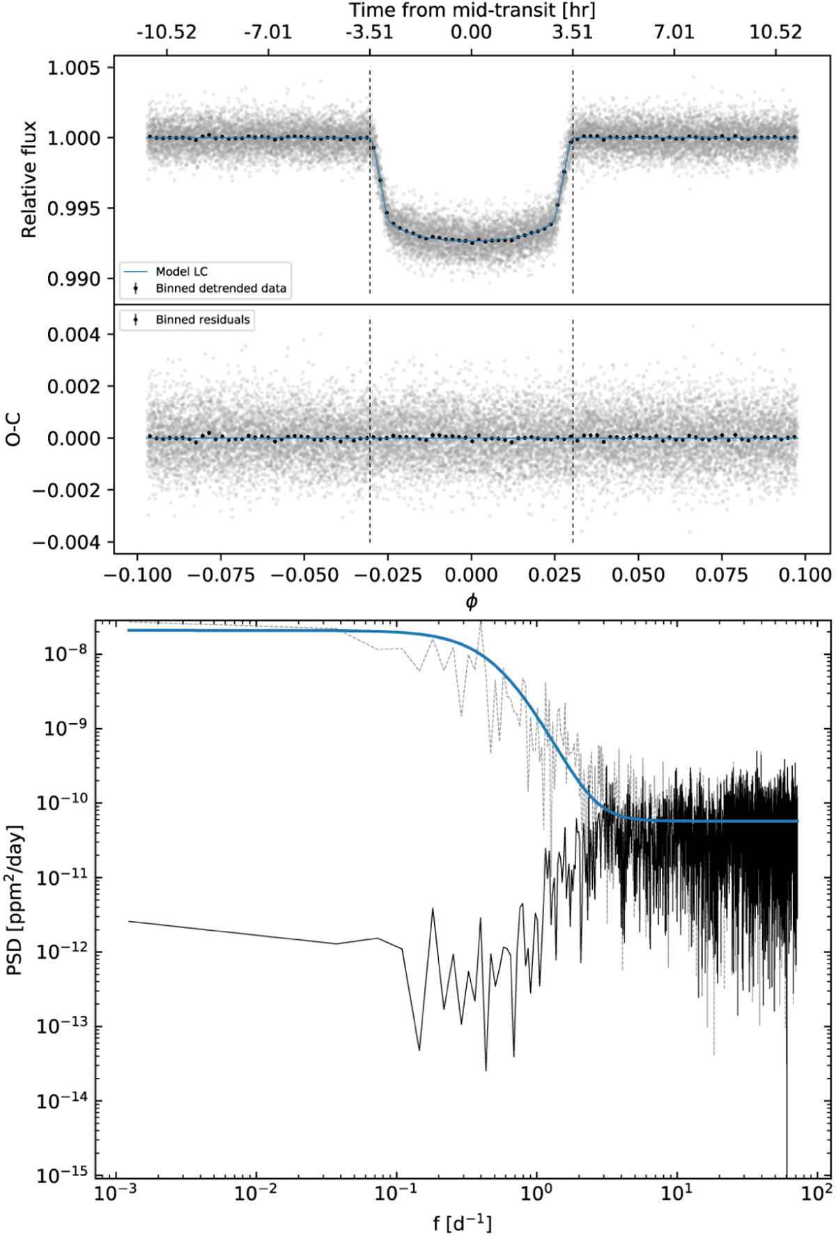
Results of the fit of the transit light curves (LCs). Top: phase-folding of the de-trended data (top panel) and the corresponding O–C diagram (bottom panel). For clarity, in each panel, we show the binned data with black dots. Bottom: power spectral analysis of the TESS photometry. The grey dashed line shows the power spectral density (PSD) of the data after removing the best-fit transit model, while the blue solid line represents the combined PSD of the best-fit Gaussian process (GP) (the shoulder at f ≲ 1 day−1) and the white noise in the data (the plateau at f ≳ 10 day−1). The black line is the PSD of the residuals of the best fit, showing that the power excess at low frequencies has been effectively removed by the GP in the model.
Current usage metrics show cumulative count of Article Views (full-text article views including HTML views, PDF and ePub downloads, according to the available data) and Abstracts Views on Vision4Press platform.
Data correspond to usage on the plateform after 2015. The current usage metrics is available 48-96 hours after online publication and is updated daily on week days.
Initial download of the metrics may take a while.