Fig. 2.
Download original image
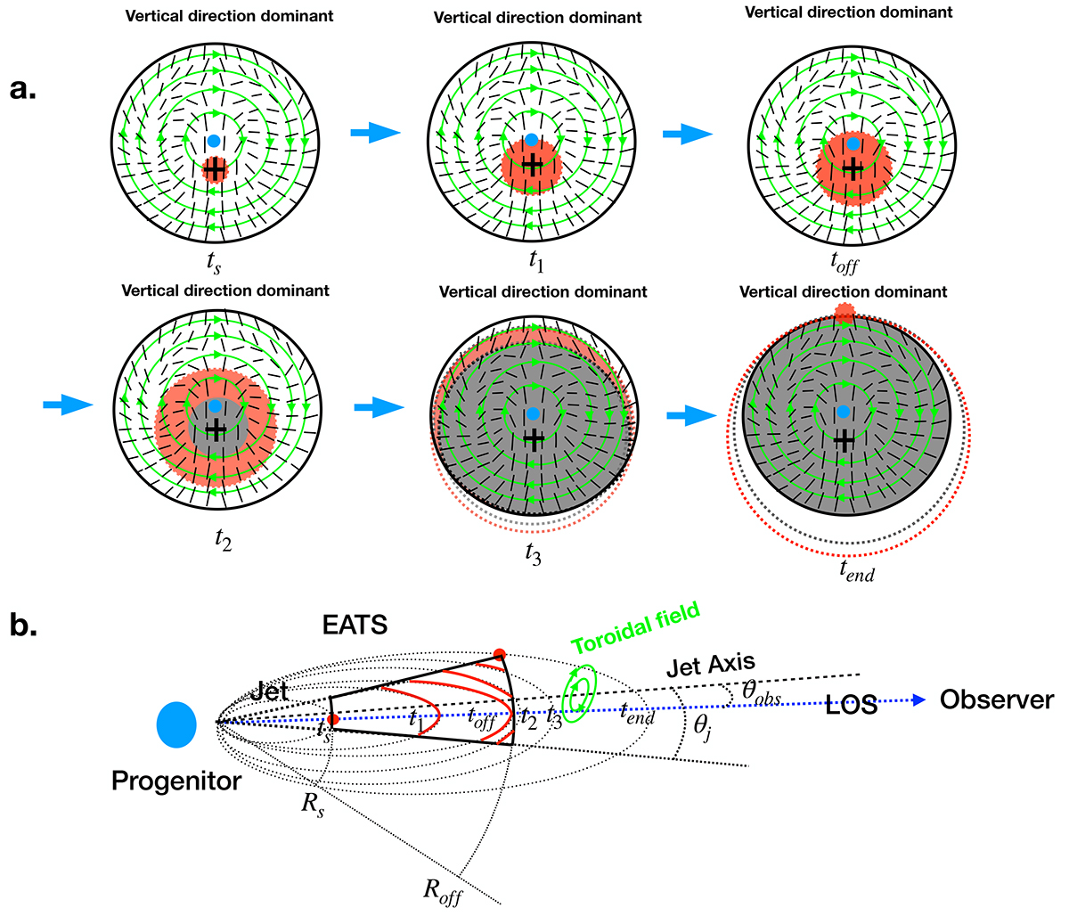
Schematic diagram of PA evolution for case of q < 0.5. The upper panels (a) show the change of the observed jet area with time on the plane of the sky. The green circle with an arrow represents the toroidal MF. The black plus symbol represents the LOS. The red area shows the observed radiation region. The gray area shows where radiation has disappeared. The short dotted lines represent the directions of the dominated polarization vectors. The bottom panel (b) shows the change of observed jet area with time on the lateral section. The red solid lines and points represent the surfaces formed by the intersection of EATS and jet at different times.
Current usage metrics show cumulative count of Article Views (full-text article views including HTML views, PDF and ePub downloads, according to the available data) and Abstracts Views on Vision4Press platform.
Data correspond to usage on the plateform after 2015. The current usage metrics is available 48-96 hours after online publication and is updated daily on week days.
Initial download of the metrics may take a while.