Fig. 2
Download original image
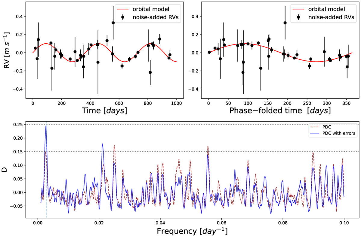
Simulated demonstration of an Earth-analog exoplanet detection. Top: simulated RV curve of a planet-hosting star, as described in Sect. 3.1. The red line represents the orbital model, and the black circles represent the simulated noisy measurements, together with the simulated error bars. Bottom: comparison of the two versions of the PDC periodogram: with (solid blue) and without (dashed red) considering the error bars. The dashed vertical line marks the frequency associated with the injected orbital period of 365 days. The lower dotted horizontal line corresponds to a FAP level of 10−2, and the upper one to a level of 10−3.
Current usage metrics show cumulative count of Article Views (full-text article views including HTML views, PDF and ePub downloads, according to the available data) and Abstracts Views on Vision4Press platform.
Data correspond to usage on the plateform after 2015. The current usage metrics is available 48-96 hours after online publication and is updated daily on week days.
Initial download of the metrics may take a while.