Fig. 6.
Download original image
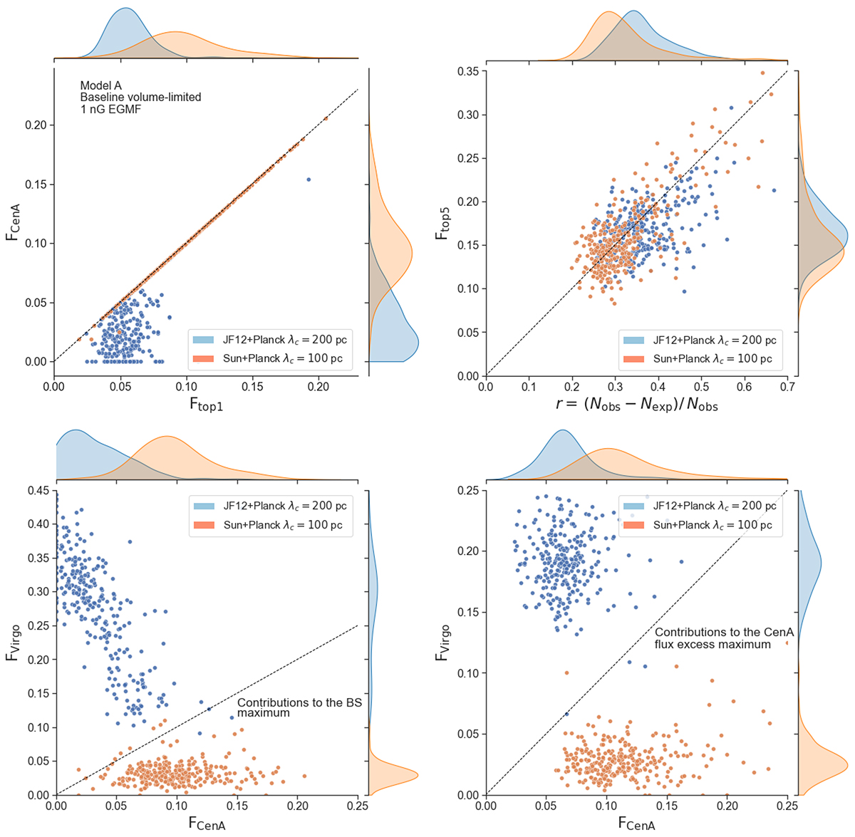
Scatter plot of the contributions of different sources to the BS maximum, for 300 realisation of the baseline scenario, with the JF12+Planck GMF model (blue dots) or the Sun+Planck GMF model (orange dots). The corresponding probability distributions are shown along the top and right borders of the plots. Top left: fraction of events coming from Cen A vs. the fraction of events coming from the dominant source (i.e. the source contributing the most to the flux in the BS maximum angular window). Top right: fraction of events coming from either of the 5 dominant sources in the BS maximum window vs. the relative flux excess, r (see text) in that window (the dashed line displayed to guide the eye is of equation y = 0.5x). Bottom left: fraction of events in the BS maximum window coming any source in the Virgo association vs. the fraction of events coming from Cen A. Bottom right: same as bottom left, but for the excess in the Cen A direction instead of the BS maximum direction. The plot thus shows the fraction of events coming from any source in the Virgo association that are found in the angular window centered on Cen A for which a flux excess has the largest significance vs. the fraction of events in that window coming from Cen A.
Current usage metrics show cumulative count of Article Views (full-text article views including HTML views, PDF and ePub downloads, according to the available data) and Abstracts Views on Vision4Press platform.
Data correspond to usage on the plateform after 2015. The current usage metrics is available 48-96 hours after online publication and is updated daily on week days.
Initial download of the metrics may take a while.