Fig. 10.
Download original image
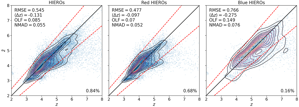
Contour plot of XGBoost predictions (z̃) versus catalogue redshifts (z) coloured by density in the (z,z̃) space for HIEROs (left panel), red HIEROs (middle panel), and blue HIEROs (right panel), all of which have HE ≤ 26. Lighter contour colours indicate higher densities. The dashed red lines show z̃ = z ± 0.15(1 + z). The percentage of objects with respect to Ntest is indicated in the bottom-right corner of each panel.
Current usage metrics show cumulative count of Article Views (full-text article views including HTML views, PDF and ePub downloads, according to the available data) and Abstracts Views on Vision4Press platform.
Data correspond to usage on the plateform after 2015. The current usage metrics is available 48-96 hours after online publication and is updated daily on week days.
Initial download of the metrics may take a while.