Fig. 9.
Download original image
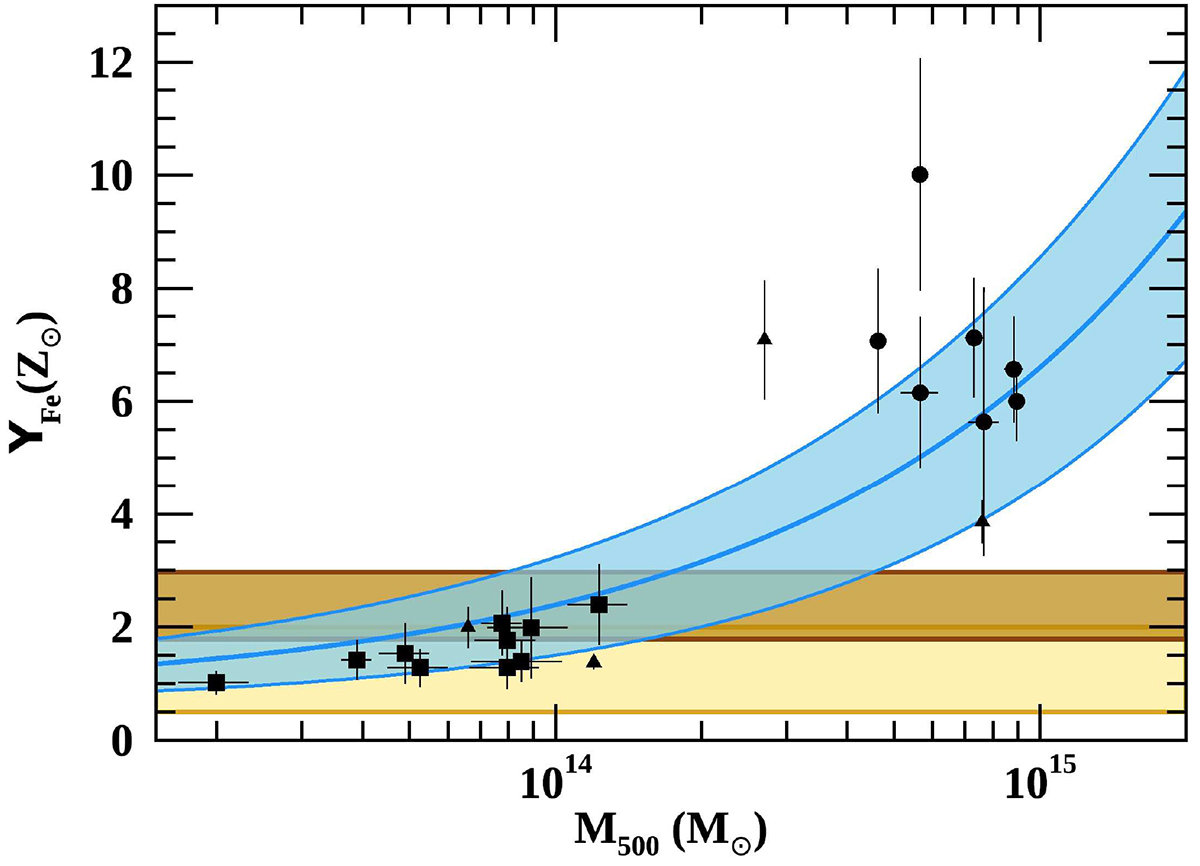
Iron yield vs. halo mass, data points are shown as filled symbols (see Gastaldello et al. 2021, for details). The blue thick line represents the relation reported in Eq. (16) and the lighter shaded blue region associated uncertainties. Predicted yields for two different estimates of SN rates (see Renzini & Andreon 2014; Freundlich & Maoz 2021) are shown as yellow and brown shaded regions, respectively.
Current usage metrics show cumulative count of Article Views (full-text article views including HTML views, PDF and ePub downloads, according to the available data) and Abstracts Views on Vision4Press platform.
Data correspond to usage on the plateform after 2015. The current usage metrics is available 48-96 hours after online publication and is updated daily on week days.
Initial download of the metrics may take a while.