Fig. 10.
Download original image
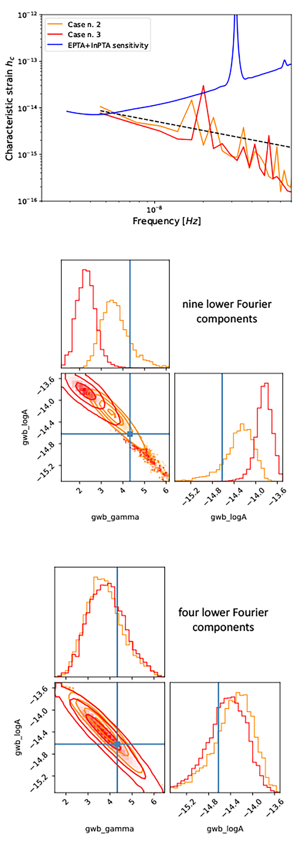
Notable realisations Case2 (orange) and Case3 (red). Top panel: GWB spectra. The dashed black line represents the f−2/3 trend. The sensitivity curve is the one presented in The International Pulsar Timing Array Collaboration et al. (2023). The central and bottom panels show corner plots of the GWB parameter posteriors inferred from the analysis using nine (central panel) and four (bottom panel) frequency bins for the GWB recovery.
Current usage metrics show cumulative count of Article Views (full-text article views including HTML views, PDF and ePub downloads, according to the available data) and Abstracts Views on Vision4Press platform.
Data correspond to usage on the plateform after 2015. The current usage metrics is available 48-96 hours after online publication and is updated daily on week days.
Initial download of the metrics may take a while.