Fig. B.3
Download original image
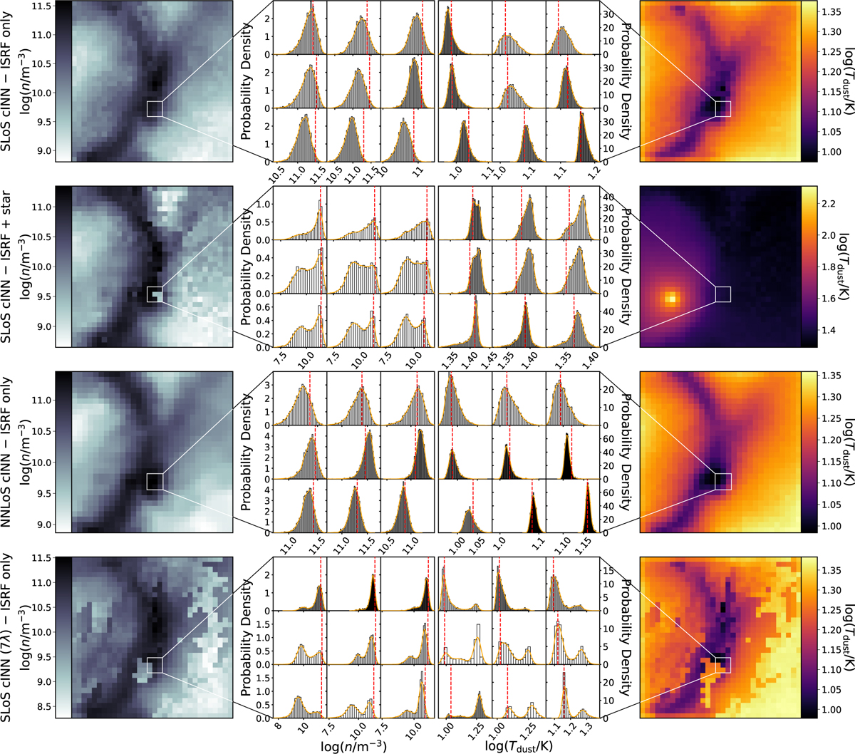
Comparison of the predicted posterior distributions for a few example pixels of the cubes shown in Figure 3. The panels in the leftmost and right-most column show the MAP prediction results for density and dust temperature for the same slice as in Figure 3, respectively. The middle two columns provide histograms of the predicted posterior distributions for the nine pixels indicated by the white square in the left-most and right-most columns. The orange curve represents the kernel density estimate used to determine the MAP values, whereas the red dashed line mark the respective ground truth value of each example pixel. We note that within each of the posterior histogram panels, the subpanels share the same x axis column-wise and the same y axis row-wise.
Current usage metrics show cumulative count of Article Views (full-text article views including HTML views, PDF and ePub downloads, according to the available data) and Abstracts Views on Vision4Press platform.
Data correspond to usage on the plateform after 2015. The current usage metrics is available 48-96 hours after online publication and is updated daily on week days.
Initial download of the metrics may take a while.