Fig. 12.
Download original image
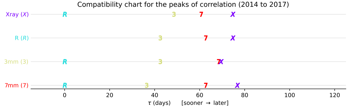
Correlations compatibility chart for τp. Each row corresponds to a band i. The delays or peak positions between the row band i and any other band j, ![]() , are plotted along the x-axis, shifted by the delay between the band i and the reference band,
, are plotted along the x-axis, shifted by the delay between the band i and the reference band, ![]() . The peaks selected are the one with highest values of the DCF, marked with red dots in Fig. 11. The DCFs here use the flaring episode from 2014 to 2017.
. The peaks selected are the one with highest values of the DCF, marked with red dots in Fig. 11. The DCFs here use the flaring episode from 2014 to 2017.
Current usage metrics show cumulative count of Article Views (full-text article views including HTML views, PDF and ePub downloads, according to the available data) and Abstracts Views on Vision4Press platform.
Data correspond to usage on the plateform after 2015. The current usage metrics is available 48-96 hours after online publication and is updated daily on week days.
Initial download of the metrics may take a while.