Fig. 1
Download original image
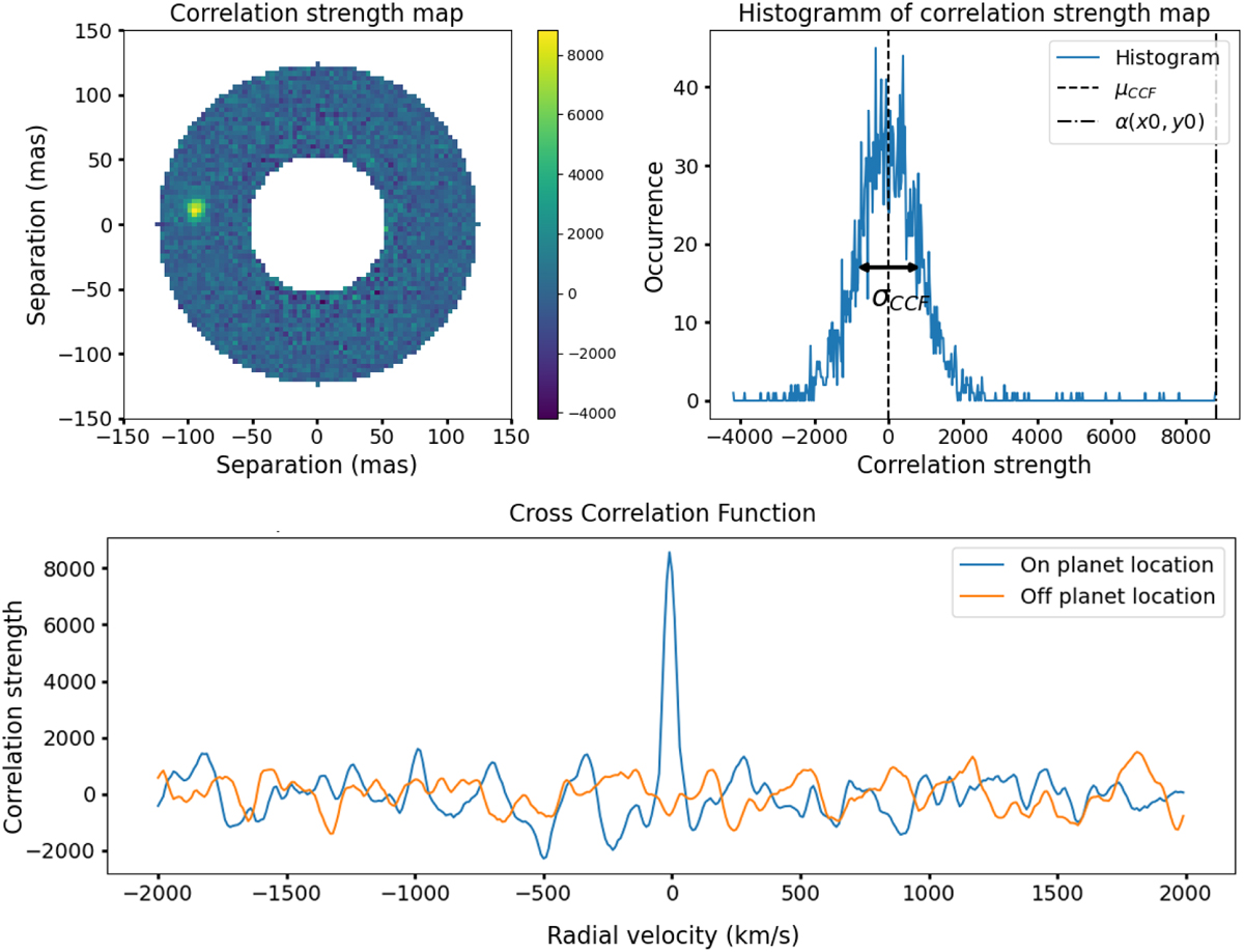
2D correlation map processed on simulated PSF with a fake planet injected, shown in the top-left panel. The colorbar represents the correlation strength between spaxels and the template. The top right panel shows the histogram of the correlation strength map, displaying the distribution of the correlation values in the annulus. Here, µCCF and σCCF denote the mean and the standard deviation of these values, respectively. Also, α(x0, y0) is the correlation at the location of the planet. Bottom panel shows the cross-correlation function on (blue) and off (orange) the planet’s location.
Current usage metrics show cumulative count of Article Views (full-text article views including HTML views, PDF and ePub downloads, according to the available data) and Abstracts Views on Vision4Press platform.
Data correspond to usage on the plateform after 2015. The current usage metrics is available 48-96 hours after online publication and is updated daily on week days.
Initial download of the metrics may take a while.