Fig. 3.
Download original image
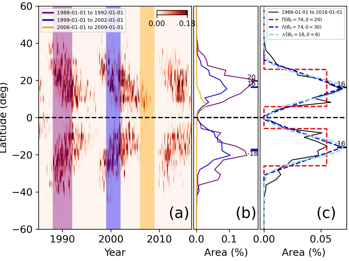
Solar activity over time. (a) Butterfly diagram for the Sun. Vertical colour bands highlight periods of maximum (1988–1992, 1999–2002) and minimum activity (2006–2009). (b) Averaged spot area for the highlighted periods. Blue and purple marks in (b) are the weighted mean for the activity latitude. (c) Filters F(θ|X) used for this study superimposed onto solar data (1986–2016). The parameters θ0 and δ are the latitude and the extension of the active region, respectively.
Current usage metrics show cumulative count of Article Views (full-text article views including HTML views, PDF and ePub downloads, according to the available data) and Abstracts Views on Vision4Press platform.
Data correspond to usage on the plateform after 2015. The current usage metrics is available 48-96 hours after online publication and is updated daily on week days.
Initial download of the metrics may take a while.