Fig. A.1.
Download original image
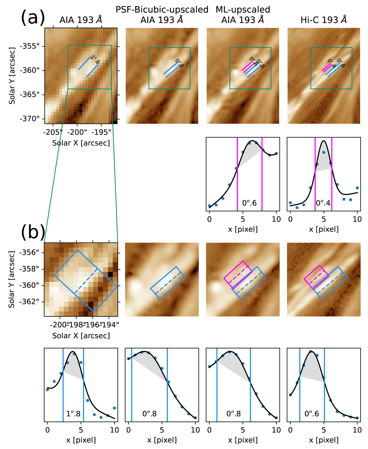
Estimated widths of the loops in the various images taken from testing and validation sets. Panel a: Comparison of close-ups of the AIA, PSF-bicubic-upscaled, ML-upscaled, and Hi-C images taken in the validation set. Panel b: Comparison of more detailed close-ups of these images. The plots above and below each panel in b show the distribution of the corresponding average intensity across the axis of the strip as indicated by the magenta and blue-dashed line, respectively. In each plot, the curve refers to the fitted Gaussian function with the linear term; the distance between the vertical line corresponds to the FWHM for the fitted function. In a, each pair of parallel lines were deposited to cover the FWHM area for the corresponding fitting function as plotted in b.
Current usage metrics show cumulative count of Article Views (full-text article views including HTML views, PDF and ePub downloads, according to the available data) and Abstracts Views on Vision4Press platform.
Data correspond to usage on the plateform after 2015. The current usage metrics is available 48-96 hours after online publication and is updated daily on week days.
Initial download of the metrics may take a while.