Fig. 6.
Download original image
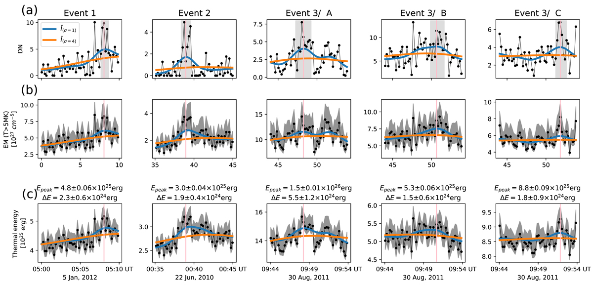
Evolutions of the identified hot emissions. Panel a: light curves of the Fe XVIII intensity of I(94 Å) − I(211 Å)/120 − I(171 Å))/450 from the hot emissions outlined by the brown boxes in Figs. 3–5. In each panel, the light-grey area indicates the time period in which the value of ![]() is higher than 1.5 times the standard deviation of
is higher than 1.5 times the standard deviation of ![]() . Panels b–c: evolutions of EM at 5–10 MK and thermal energy E from the locations of the hot emissions, in which the grey-shaded area denotes the standard deviation of 200 Monte Carlo simulations by adding random AIA instrument noise into the EM inversion. In each panel, the dots with thin lines indicate the raw data; the blue and orange curves indicate the data smoothed with a Gaussian kernel of 1 and 4 min, respectively. The vertical line indicates the peak time of
. Panels b–c: evolutions of EM at 5–10 MK and thermal energy E from the locations of the hot emissions, in which the grey-shaded area denotes the standard deviation of 200 Monte Carlo simulations by adding random AIA instrument noise into the EM inversion. In each panel, the dots with thin lines indicate the raw data; the blue and orange curves indicate the data smoothed with a Gaussian kernel of 1 and 4 min, respectively. The vertical line indicates the peak time of ![]() , which amounts to
, which amounts to ![]() .
.
Current usage metrics show cumulative count of Article Views (full-text article views including HTML views, PDF and ePub downloads, according to the available data) and Abstracts Views on Vision4Press platform.
Data correspond to usage on the plateform after 2015. The current usage metrics is available 48-96 hours after online publication and is updated daily on week days.
Initial download of the metrics may take a while.