Fig. C.1
Download original image
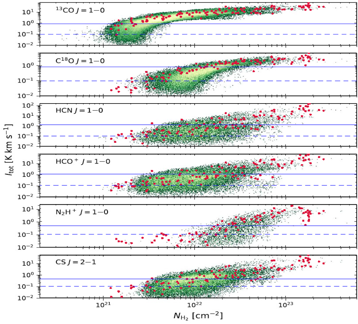
Comparison between the Orion A sampling observations and the mapping data of Yun et al. (2021). The figure presents a scanned copy of Fig. 15 from Yun et al. (2021), with red circles representing the intensities derived from the sampling observations. The solid blue line represents the approximate 3σ limit of the mapping data calculated using the velocity range of integration given by Yun et al. (2021) in their Table 2 and the rms noise in the spectra given in their Fig. 8. The dashed line represents the equivalent limit for the sampling data. See the main text for further details.
Current usage metrics show cumulative count of Article Views (full-text article views including HTML views, PDF and ePub downloads, according to the available data) and Abstracts Views on Vision4Press platform.
Data correspond to usage on the plateform after 2015. The current usage metrics is available 48-96 hours after online publication and is updated daily on week days.
Initial download of the metrics may take a while.