Fig. 4.
Download original image
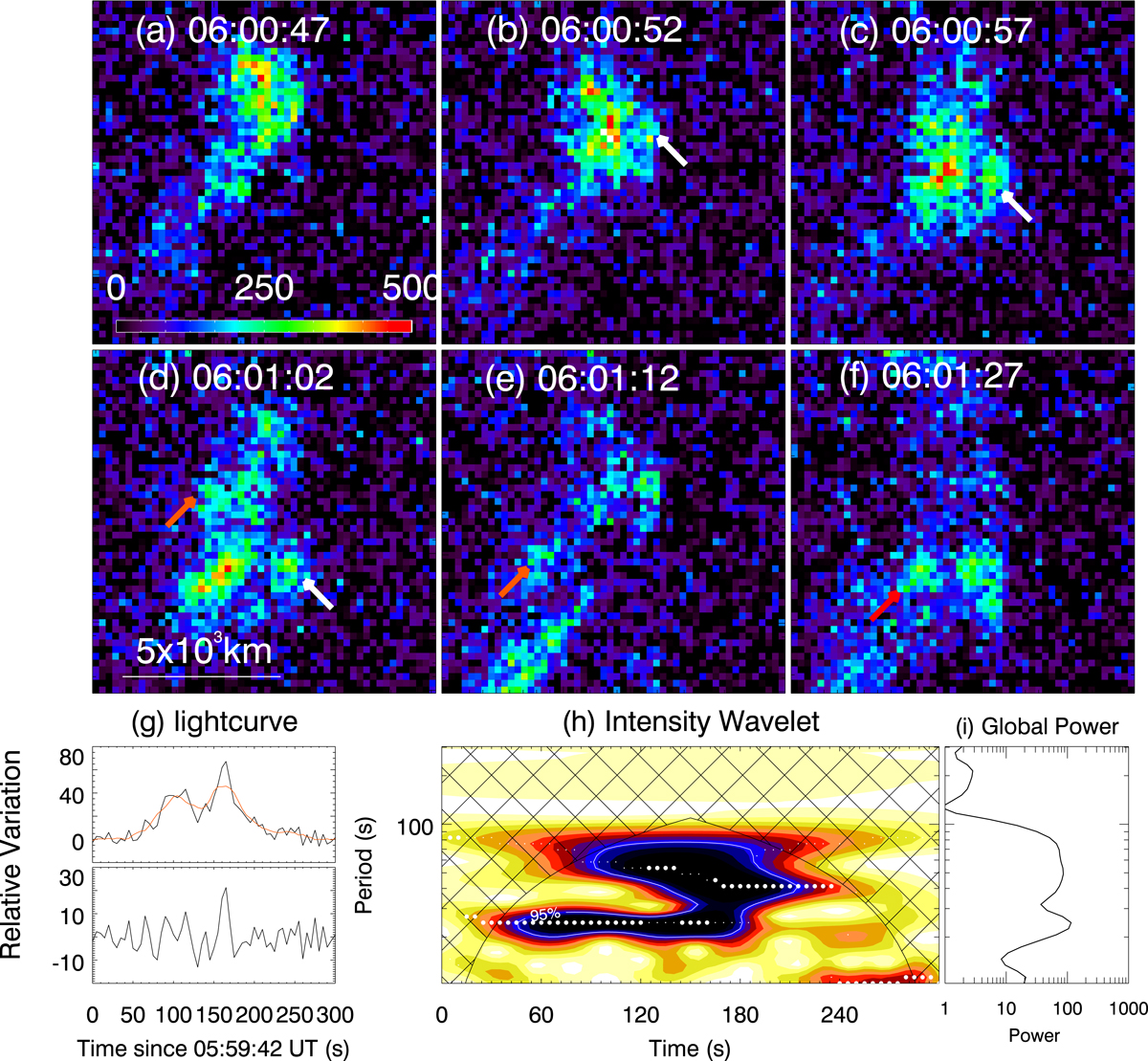
Development of a KVS in the jet flows. (a–f): evolution of the region where the jet interacts with the coronal plumes viewed in EUI 174 Å. These are base-different images, each of which is the difference between the observation at the given time and that at 05:58:52 UT. The white arrows point to and follow a vortex structure that is detaching from the main stream of the jet flows, and the red arrows are tracking another one. (g): light curve (top plot) and detrended light curve (bottom plot) obtained from the location marked as ‘SS’ in Fig. 1b, giving the relative variations of the brightness of the region. The detrended light curve is the difference as given by subtracting the trend (the red line in the top plot) from the original light curve (black line in the top plot). (h): wavelet power map of the detrended light curve shown in panel g, in which a darker color corresponds to a greater power. The white dots denote the periods with maximum power at the corresponding time. The region with confidence level greater than 95% is enclosed by the contours. The cross-hatched region indicates the ranges of periods and times where edge effects become important. (i): global wavelet power summed from panel h, indicating the dominant period at 25 s in the light curve.
Current usage metrics show cumulative count of Article Views (full-text article views including HTML views, PDF and ePub downloads, according to the available data) and Abstracts Views on Vision4Press platform.
Data correspond to usage on the plateform after 2015. The current usage metrics is available 48-96 hours after online publication and is updated daily on week days.
Initial download of the metrics may take a while.