Fig. 7.
Download original image
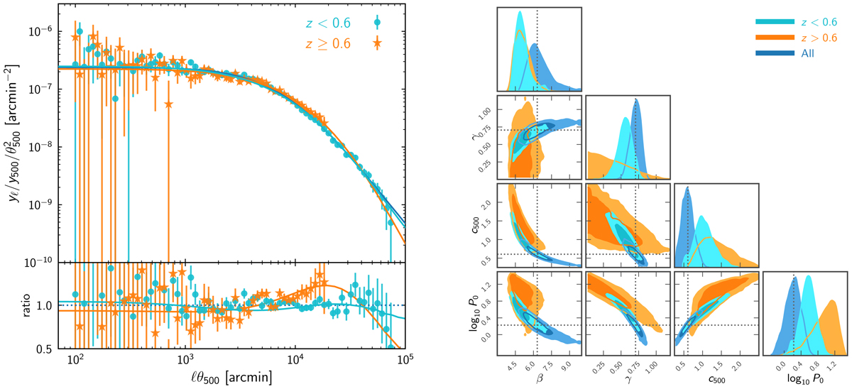
Redshift subsamples. Left: average pressure profile for z < 0.6 (cyan circles), and z ≥ 0.6 (orange stars). The solid blue line is the best-fitting gNFW model for the full sample (Table 1); the ratio plot on the bottom panel is calculated with respect to the best fit for the full sample. Right: marginalised posterior likelihood for the parameters of the best-fitting gNFW model of the low z (cyan) and high z (orange) subsamples, compared to the results for the full sample (blue). Contours represent the 68% and 95% confidence regions.
Current usage metrics show cumulative count of Article Views (full-text article views including HTML views, PDF and ePub downloads, according to the available data) and Abstracts Views on Vision4Press platform.
Data correspond to usage on the plateform after 2015. The current usage metrics is available 48-96 hours after online publication and is updated daily on week days.
Initial download of the metrics may take a while.