Fig. 10.
Download original image
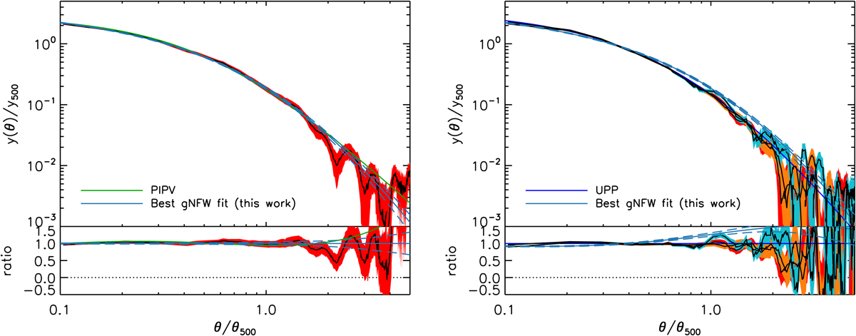
Reconstructed Compton profiles (2D real space). Left: reconstructed Compton profile (2D real space) from the data points of Fig. 5 left. The 68% C.L. envelope is shown in red and the mean in black. The solid green line is the PIPV profile. The solid blue line is the best gNFW fit. The dashed blue lines delineate the 68% C.L. of the gNFW fit. In the bottom panel, the ratio is computed with respect to the best fit. Right: same as the left panel, but with simulated UPP profiles injected into actual data, extracted and reconstructed using the same method as on the real clusters. We performed three injections of simulated SPT clusters at different locations. The reconstructed profiles are in red, orange and cyan. The solid bright blue line is the UPP.
Current usage metrics show cumulative count of Article Views (full-text article views including HTML views, PDF and ePub downloads, according to the available data) and Abstracts Views on Vision4Press platform.
Data correspond to usage on the plateform after 2015. The current usage metrics is available 48-96 hours after online publication and is updated daily on week days.
Initial download of the metrics may take a while.