Fig. 3.
Download original image
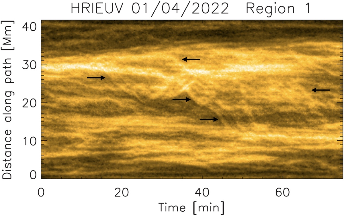
Time-distance diagram along the dashed white curve in Fig. 1 (right panel) for the April 1st HRIEUV observation. The distance 0 corresponds to the western end of the curve. The curve crosses a loop bundle at the apex, which is seen to undergo a large-scale reconfiguration (radially inward, corresponding to shrinkage), as pointed out by the arrows. This time-distance diagram is made from images that have been processed with the wavelet-optimised whitening enhancement technique of Auchère et al. (2023).
Current usage metrics show cumulative count of Article Views (full-text article views including HTML views, PDF and ePub downloads, according to the available data) and Abstracts Views on Vision4Press platform.
Data correspond to usage on the plateform after 2015. The current usage metrics is available 48-96 hours after online publication and is updated daily on week days.
Initial download of the metrics may take a while.