Fig. 9
Download original image
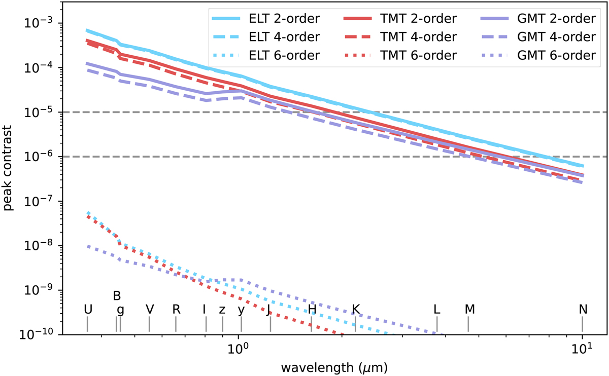
Peak contrast as a function of wavelength and different coronagraphs for the ELT (blue), GMT (purple), and TMT (red). Each color represents a different telescope, and the line style changes for each coronagraph. The solid lines show the performance of a second-order coronagraph (theoretically “perfect” for an unaberrated system), the dashed lines that of a fourth-order coronagraph, and the dotted lines that of a sixth-order coronagraph. The center wavelength of each of the simulated photometric bands is shown at the bottom of the figure. The peak contrast shows an exponential decline with increasing wavelength. A peak contrast of 10−5 is reached between H and K bands.
Current usage metrics show cumulative count of Article Views (full-text article views including HTML views, PDF and ePub downloads, according to the available data) and Abstracts Views on Vision4Press platform.
Data correspond to usage on the plateform after 2015. The current usage metrics is available 48-96 hours after online publication and is updated daily on week days.
Initial download of the metrics may take a while.