Fig. 7
Download original image
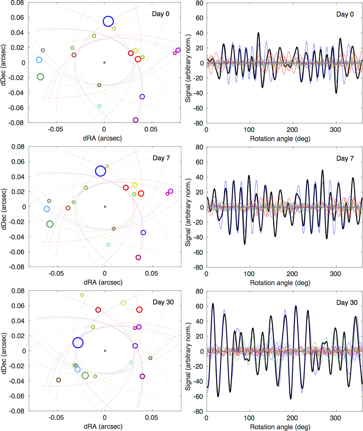
Simulations of a crowded exocometary field. The three rows correspond to three different dates. Upper: day 0. Middle: day 7. Lower: day 30. The left column contains maps of the spatial distribution of the exocomets. Each circle is an exocomet, where the radius of the circle is directly proportional to the effective radius of the cometary coma. Each comet has its own color, and the dashed lines of each color corresponds to the orbital track of that particular comet. The right column shows the interferometric signal as a black thick line. For illustrative purposes, the contribution of each individual comet is plotted as a thin line that is color-matched with the corresponding symbol in the left column. The individual colored components cannot be measured directly; they can only be deduced from the total signal and its evolution in time, wavelength, and (if relevant) along different probed interferometric baselines. See the text for discussion.
Current usage metrics show cumulative count of Article Views (full-text article views including HTML views, PDF and ePub downloads, according to the available data) and Abstracts Views on Vision4Press platform.
Data correspond to usage on the plateform after 2015. The current usage metrics is available 48-96 hours after online publication and is updated daily on week days.
Initial download of the metrics may take a while.