Fig. 3.
Download original image
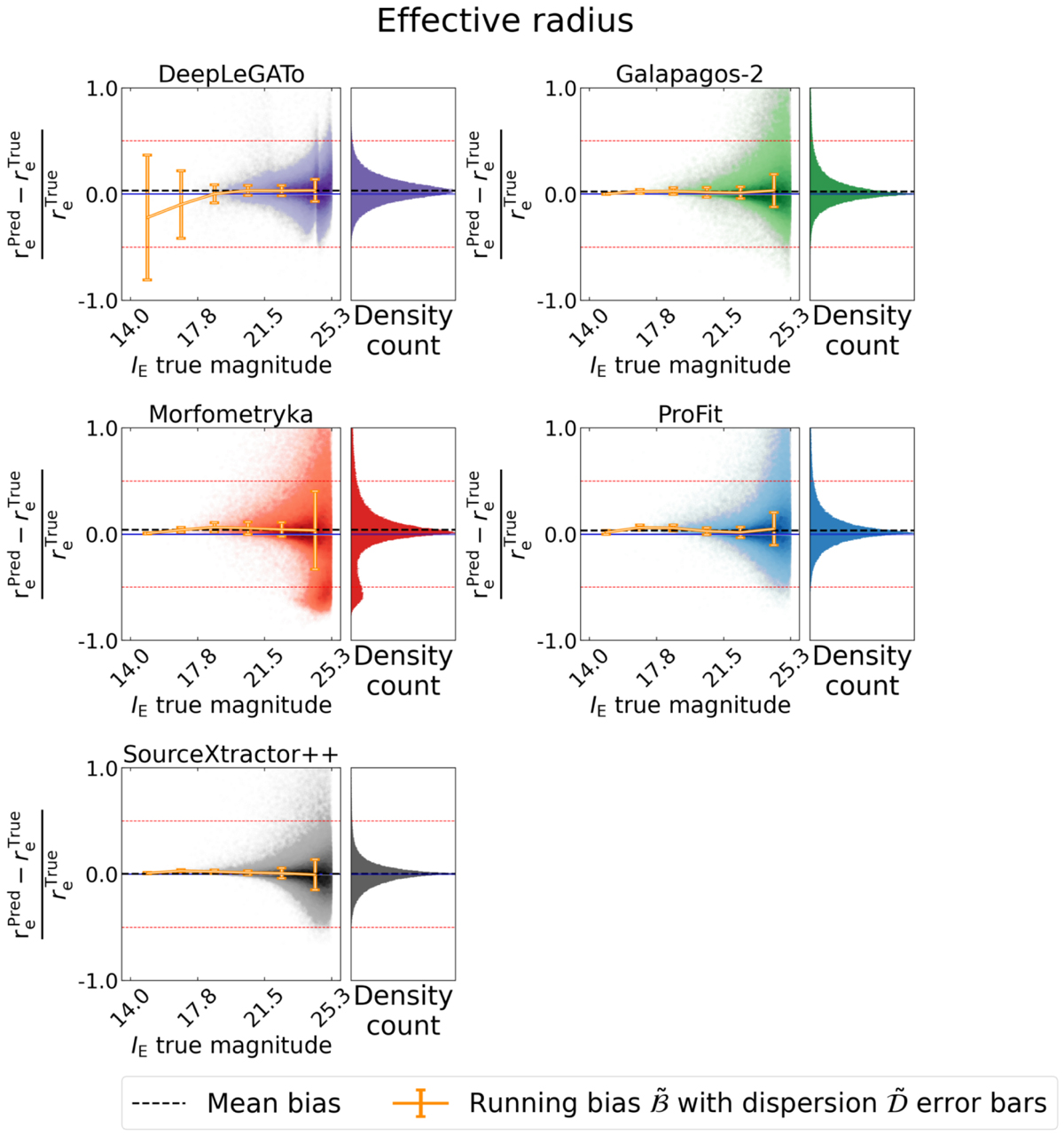
Scatter plots showing the recovery of the half-light radius measured from the single-Sérsic simulation. Each panel shows a different code. The main plot of each panel shows the relative bias per galaxy as a function of apparent IE magnitude, while we summarise the bias distribution as a histogram on the right. The opacity is proportional to the density; the darker colours mean more points. The blue solid line highlights a zero bias for reference, and the grey dashed line represents the mean value of the bias for all magnitude bins together. The orange points indicate the running mean bias ℬ in bins of magnitude, with error bars representing the dispersion 𝒟 (see Sect. 3).
Current usage metrics show cumulative count of Article Views (full-text article views including HTML views, PDF and ePub downloads, according to the available data) and Abstracts Views on Vision4Press platform.
Data correspond to usage on the plateform after 2015. The current usage metrics is available 48-96 hours after online publication and is updated daily on week days.
Initial download of the metrics may take a while.