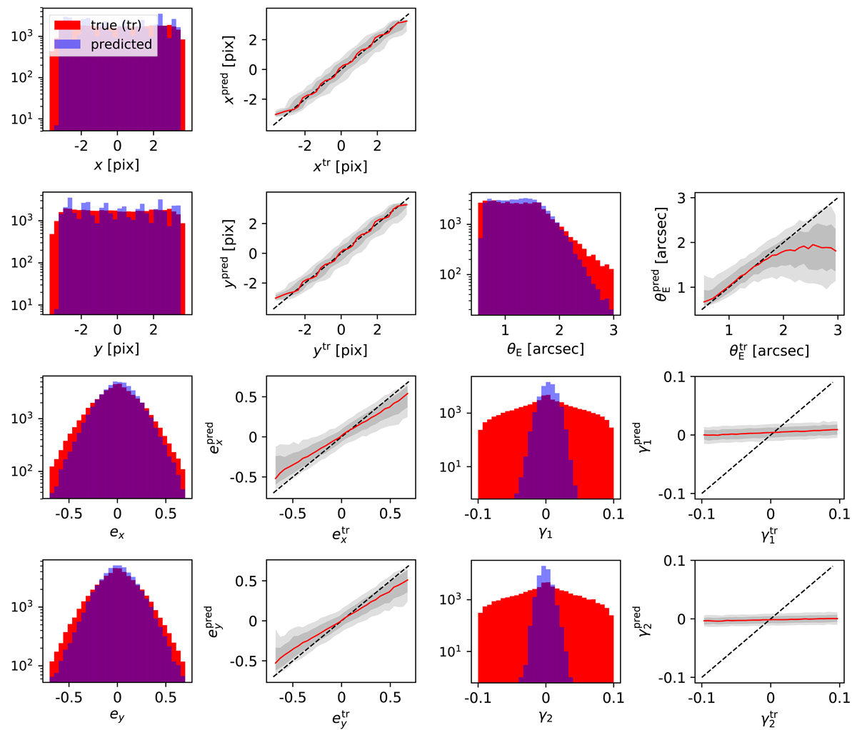
Fig. 4.
Download original image
Comparison between the ground truth and prediction of our final network. In the left panel of each column we show histograms of the ground truth (red) and predicted values (blue). In the right panel we directly plot the predicted value (y-axis) against the true value, showing the median as a red line with 1![]() and 2
and 2![]() ranges (gray shaded) inferred from the distribution of median values of the test set.
ranges (gray shaded) inferred from the distribution of median values of the test set.
Current usage metrics show cumulative count of Article Views (full-text article views including HTML views, PDF and ePub downloads, according to the available data) and Abstracts Views on Vision4Press platform.
Data correspond to usage on the plateform after 2015. The current usage metrics is available 48-96 hours after online publication and is updated daily on week days.
Initial download of the metrics may take a while.