Fig. 5
Download original image
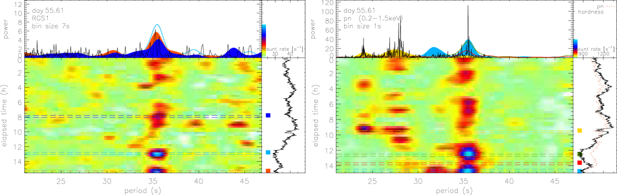
XMM-Newton RGS (left) and pn (right, soft 0.2–1.5 keV range) periodogram time maps illustrating the evolution of periods focusing on the 35 s period detected during the 2006 outburst. Each graph consists of four panels: in the main (bottom left) panel, time is running down and the tested periods run from left to right, while the panel above shows representative Lomb–Scargle periodograms on the same shared horizontal axis. The bottom-right panel shows the light curve along the same vertical time axis. The colour bar in the top right allows conversion of colours in the main panel to the units of power used for the periodograms. The vertical time axis is in units of elapsed hours since the start of the RGS1 exposure (left panel), and the pn exposure (right panel) which started 2250 s (0.6 h) later than the RGS1 exposure owing to the higher pn overhead. In the respective top panels, the black curves show the periodograms from the respective entire light curves and the colour-shaded curves are periodograms from the selected 2000 s time intervals marked with horizontal lines of the same colour as the dashed lines in the panels below. The time bin sizes of the light curves are included in the respective top-left panels. The same time maps were produced with different bin sizes, yielding similar results.
Current usage metrics show cumulative count of Article Views (full-text article views including HTML views, PDF and ePub downloads, according to the available data) and Abstracts Views on Vision4Press platform.
Data correspond to usage on the plateform after 2015. The current usage metrics is available 48-96 hours after online publication and is updated daily on week days.
Initial download of the metrics may take a while.