Fig. 14
Download original image
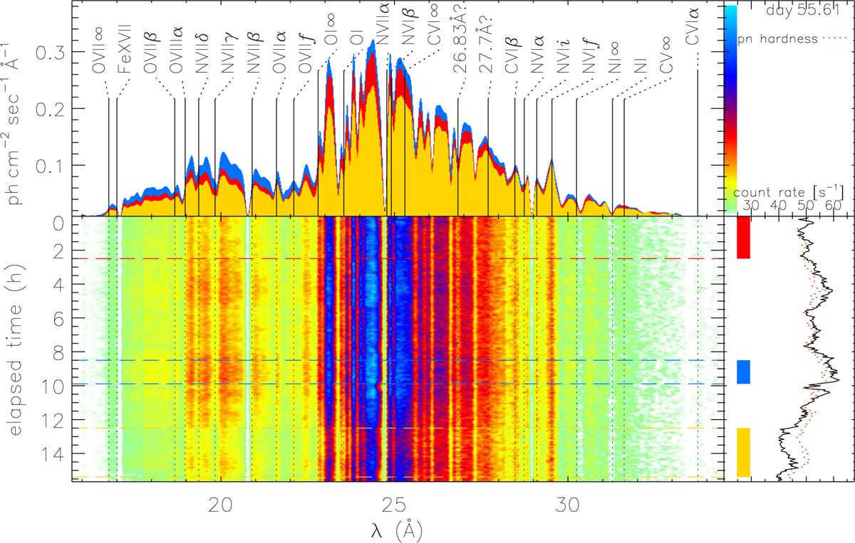
Spectral time map based on 281 RGS spectra extracted from adjacent 200 s time intervals from the 2021d55.6 observation. The main panel shows the spectra with wavelength from left to right, time from top to bottom, and colours representing flux following the (non-linear) bar in the top right panel along the vertical flux axis. The dashed horizontal lines and shadings with the same colours in the bottom right panel indicate time intervals from which the spectra shown with the same colour shadings in the top left panel were extracted. The brown dotted line in the light curve panel in the bottom right represents the hardness light curve extracted from the pn where hardness is scaled to fit into the graph while varying between values −0.580 and −0.397.
Current usage metrics show cumulative count of Article Views (full-text article views including HTML views, PDF and ePub downloads, according to the available data) and Abstracts Views on Vision4Press platform.
Data correspond to usage on the plateform after 2015. The current usage metrics is available 48-96 hours after online publication and is updated daily on week days.
Initial download of the metrics may take a while.