Fig. 6
Download original image
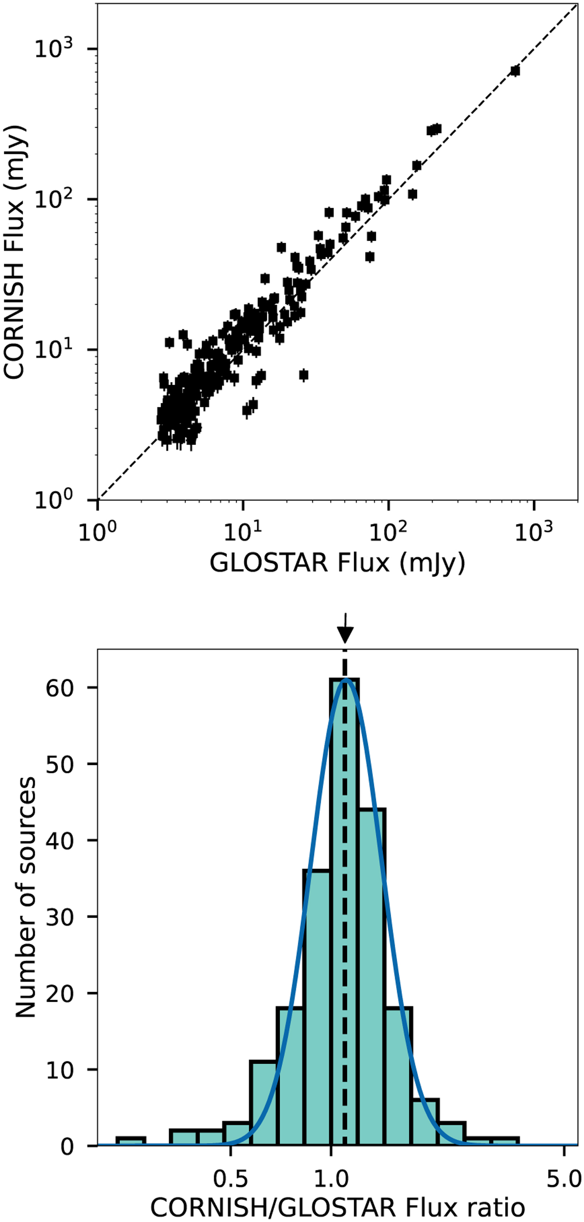
Flux density comparison of GLOSTAR and CORNISH results. Upper panel: comparison of the peak flux densities of radio sources detected in GLOSTAR-B and CORNISH. Lower panel: histogram of the ratio between the peak flux densities of CORNISH and GLOSTAR. The width of the bars is 0.08 dex. The blue line indicates the model from the Gaussian fit to the histogram. The dashed line indicates the mean value of the distribution. The small arrow at the top of the plot shows the expected CORNISH/GLOSTAR flux density ratio for the different observed mean frequency.
Current usage metrics show cumulative count of Article Views (full-text article views including HTML views, PDF and ePub downloads, according to the available data) and Abstracts Views on Vision4Press platform.
Data correspond to usage on the plateform after 2015. The current usage metrics is available 48-96 hours after online publication and is updated daily on week days.
Initial download of the metrics may take a while.