Fig. 1.
Download original image
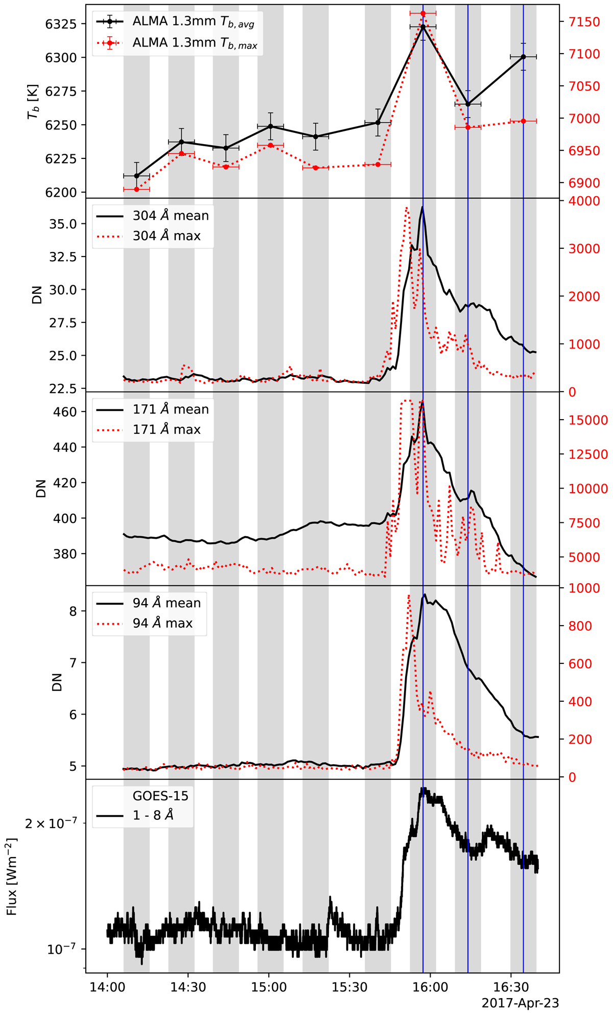
Intensity profiles for the SOL2017-04-23 flare. Gray-shaded areas represent time intervals during which an ALMA image was obtained. Black curves show intensities spatially averaged over the flare region, and red curves show peak intensities within the flare region. The scale of the red curves is given on the right axis in the same units as the black curves given on the left axis. Vertical blue lines denote instants that are shown in cutout images and were further analyzed. The same representation is used in all subsequent intensity profiles.
Current usage metrics show cumulative count of Article Views (full-text article views including HTML views, PDF and ePub downloads, according to the available data) and Abstracts Views on Vision4Press platform.
Data correspond to usage on the plateform after 2015. The current usage metrics is available 48-96 hours after online publication and is updated daily on week days.
Initial download of the metrics may take a while.