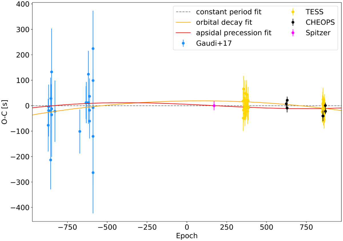
Fig. 2
Download original image
O–C plot showing the deviations in transit time from the best-fit linear ephemeris (grey dashed line) for KELT-9 b. The transit number is shown on the x-axis. The y-axis shows the difference in observed and calculated mid-transit time. The orange line shows the best orbital decay fit to the KELT-9 b TTV data, with the red line showing the best apsidal precession fit. CHEOPS data are highlighted in black.
Current usage metrics show cumulative count of Article Views (full-text article views including HTML views, PDF and ePub downloads, according to the available data) and Abstracts Views on Vision4Press platform.
Data correspond to usage on the plateform after 2015. The current usage metrics is available 48-96 hours after online publication and is updated daily on week days.
Initial download of the metrics may take a while.