Fig. 16
Download original image
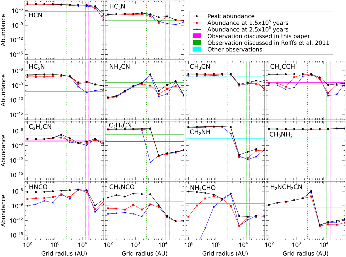
Spatial distribution of abundances of selected species at three selected times in simulation. Red, blue, and black curves show the spatial distribution of abundances at ~1.5 × 10⁵ yr, ~2.5 × 10⁵ yr, and the peak abundance, respectively. Peak abundance is the max abundance during the warm-up and post-warm-up phases. Here, we considered the initial dust temperature of 15 K. Green dotted (at 2580 AU), green dashed (at 12 900 AU), and pink dashed (at 17 200 AU) lines represent the highest spatial resolution (0.3″) and the moderate resolution (1.5″) of Rolffs et al. (2011b), and our resolution (2″), respectively. Pink horizontal bar represents observed abundance range.
Current usage metrics show cumulative count of Article Views (full-text article views including HTML views, PDF and ePub downloads, according to the available data) and Abstracts Views on Vision4Press platform.
Data correspond to usage on the plateform after 2015. The current usage metrics is available 48-96 hours after online publication and is updated daily on week days.
Initial download of the metrics may take a while.