Fig. 10
Download original image
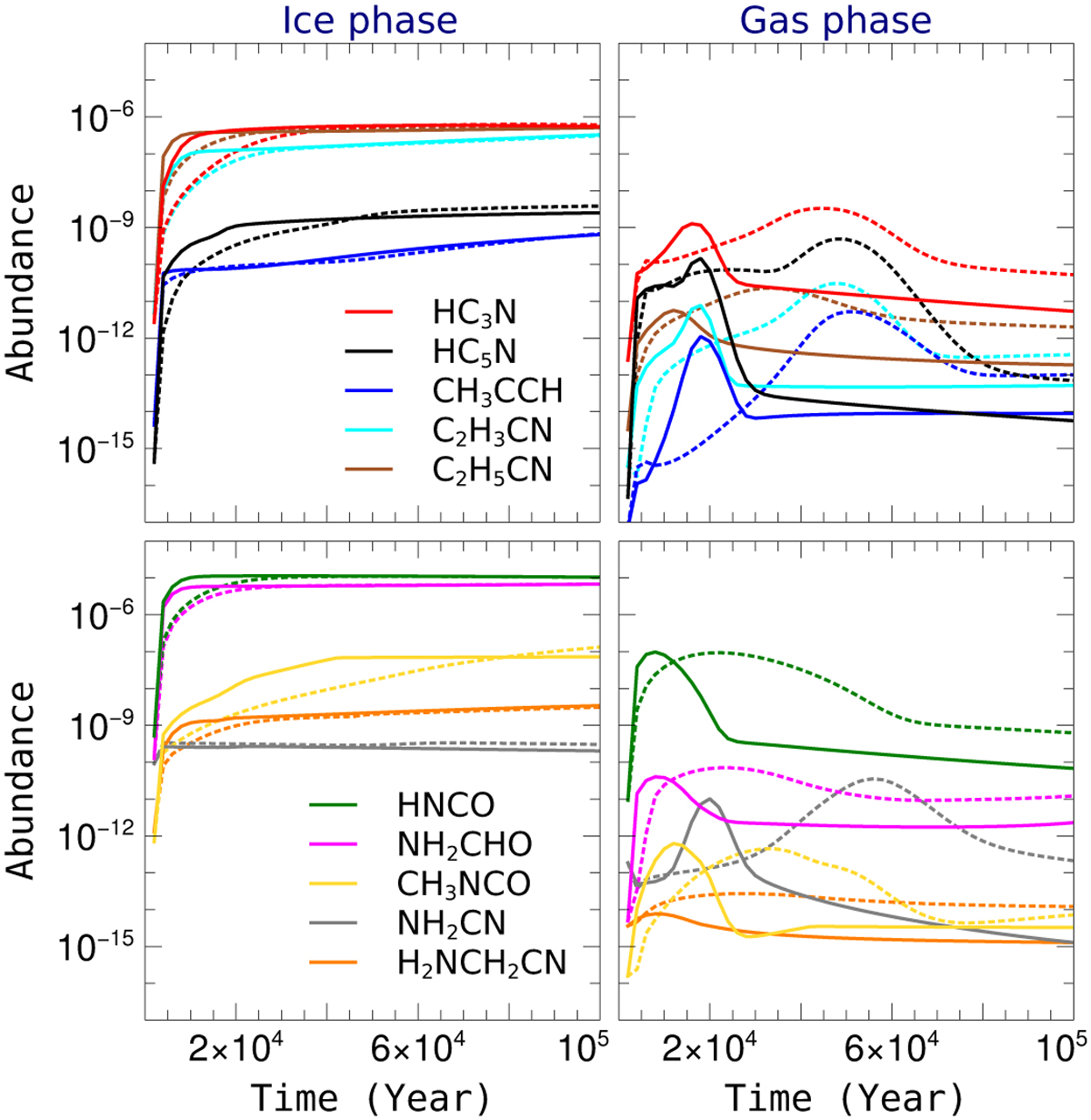
Impact of peak H density (solid lines (107 cm−3) versus dotted lines (106 cm−3)) on simulated abundances of selected species during the cloud-collapse phase. Plots on the left and the right are for the ice and gas-phase abundances, respectively. Legends in the top left plot are for both plots at the top, and legends in the bottom left plot are for both plots at the bottom. All solid lines are for model N7-Tg200-Td20, and all dotted lines are for model N6-Tg200-Td20 (see Table 3 for details of each model).
Current usage metrics show cumulative count of Article Views (full-text article views including HTML views, PDF and ePub downloads, according to the available data) and Abstracts Views on Vision4Press platform.
Data correspond to usage on the plateform after 2015. The current usage metrics is available 48-96 hours after online publication and is updated daily on week days.
Initial download of the metrics may take a while.