Fig. 5.
Download original image
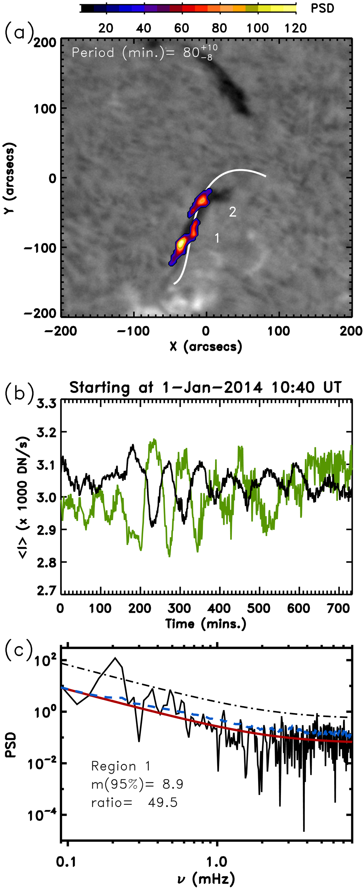
Results of the automatic detection technique in the event of January 1, 2014. In (a) the coloured areas are the cut of the whitened PSD (see text). It is plotted over an Hα map of the region. Two clusters are detected and are labelled region 1 and 2. The period with maximum PSD and its uncertainty is printed at the top of the panel. In (b) the intensity averaged over the whole region 1 (black curve) and the average intensity of region 2 (green curve) are shown. The time is shown on the horizontal axis in minutes starting at 10:40 UT. In (c) the PSD (solid line) with the highest value in the whole ROI is shown, that is, within region 1. The red lines shows the background noise, σij, and the thick dash-dotted line is the detection threshold, 8.9σij, at the given pixel. The dashed blue line shows the noise averaged over the entire ROI, ⟨σ⟩.
Current usage metrics show cumulative count of Article Views (full-text article views including HTML views, PDF and ePub downloads, according to the available data) and Abstracts Views on Vision4Press platform.
Data correspond to usage on the plateform after 2015. The current usage metrics is available 48-96 hours after online publication and is updated daily on week days.
Initial download of the metrics may take a while.