Fig. 12
Download original image
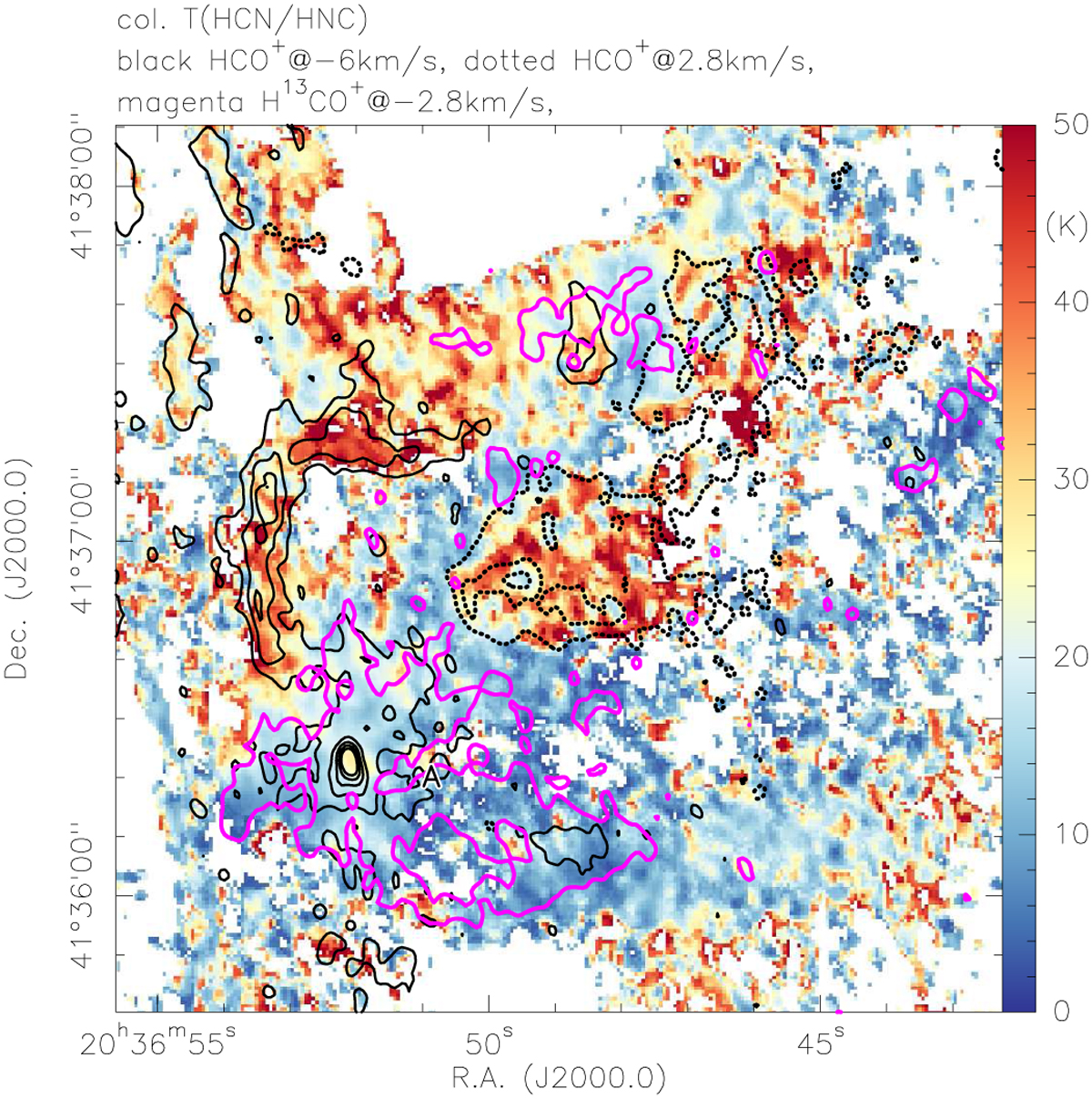
Zoom of the temperature map for the northwestern area around clump A. The color-scale again shows the temperature map derived from the integrated intensity ratios of the HCN(1−0) and HNC(1−0) line following Hacar et al. (2020). The contours outline HCO+ and H13CO+ emission structures at specific velocities (Fig. 8). Full black contours plot HCO+ at −6km s−1, dotted contours show HCO+ at 2.8km s−1, and magenta contours show H13CO+ at -2.8km s-1. Contour levels for HCO+ start at 5σ and continue in 10σ steps. For H13CO+ only the 5σ contour of 6 mJy beam−1 is shown.
Current usage metrics show cumulative count of Article Views (full-text article views including HTML views, PDF and ePub downloads, according to the available data) and Abstracts Views on Vision4Press platform.
Data correspond to usage on the plateform after 2015. The current usage metrics is available 48-96 hours after online publication and is updated daily on week days.
Initial download of the metrics may take a while.