Fig. 1
Download original image
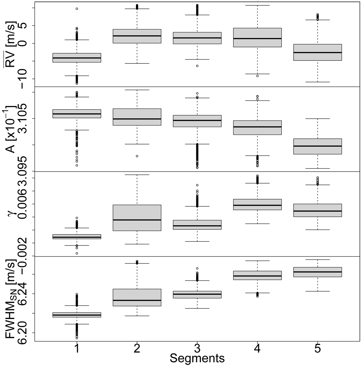
Boxplots of the response variable ![]() and of the activity indicators A, γ, and FWHMSN for each segment of the optimal partition found by the bp method when applied to the α Cen B RV time series. We recall that a boxplot is a graphical tool that visualizes a distribution; the median is shown by the thick horizontal line, while the box extension defines the interquartile range (IQR), being bounded by the first (Q1) and third (Q3) quartiles. The upper and lower limits of the vertical dashed lines (the whiskers) are defined as min {max(X), Q3 + 1.5 · IQR} and max {min (X), Q1 − 1.5 · IQR}, respectively, where X indicates the sample to be represented. Outliers beyond the whiskers (if any) are represented as empty dots.
and of the activity indicators A, γ, and FWHMSN for each segment of the optimal partition found by the bp method when applied to the α Cen B RV time series. We recall that a boxplot is a graphical tool that visualizes a distribution; the median is shown by the thick horizontal line, while the box extension defines the interquartile range (IQR), being bounded by the first (Q1) and third (Q3) quartiles. The upper and lower limits of the vertical dashed lines (the whiskers) are defined as min {max(X), Q3 + 1.5 · IQR} and max {min (X), Q1 − 1.5 · IQR}, respectively, where X indicates the sample to be represented. Outliers beyond the whiskers (if any) are represented as empty dots.
Current usage metrics show cumulative count of Article Views (full-text article views including HTML views, PDF and ePub downloads, according to the available data) and Abstracts Views on Vision4Press platform.
Data correspond to usage on the plateform after 2015. The current usage metrics is available 48-96 hours after online publication and is updated daily on week days.
Initial download of the metrics may take a while.