Fig. 6
Download original image
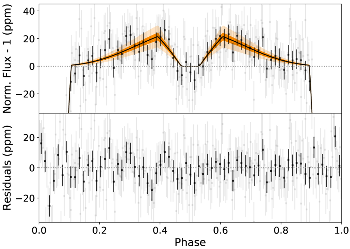
Phase curve of K2-141 b as seen by Kepler during Campaign 12 and 19. Upper panel: the solid black line shows the phase curve based on the values in our best fit model (toy model without heat redistribution for the thermal emission and a uniform Lambertian reflector for the reflected light contribution). The dark orange and light orange areas around the best fitting model are the 1σ and 3σ uncertainties, respectively. We binned the Campaign 19 data that was collected in short cadence mode (~1 min) into bins of 29.4 min to have the same temporal resolution as the Campaign 12 data. We then phase folded the Kepler observations and binned the data for clarity. Each bin in black (gray) consists out of 180 (45) Kepler exposures. Lower panel: the residuals of the Kepler observations to the best fitting model.
Current usage metrics show cumulative count of Article Views (full-text article views including HTML views, PDF and ePub downloads, according to the available data) and Abstracts Views on Vision4Press platform.
Data correspond to usage on the plateform after 2015. The current usage metrics is available 48-96 hours after online publication and is updated daily on week days.
Initial download of the metrics may take a while.