Fig. 1
Download original image
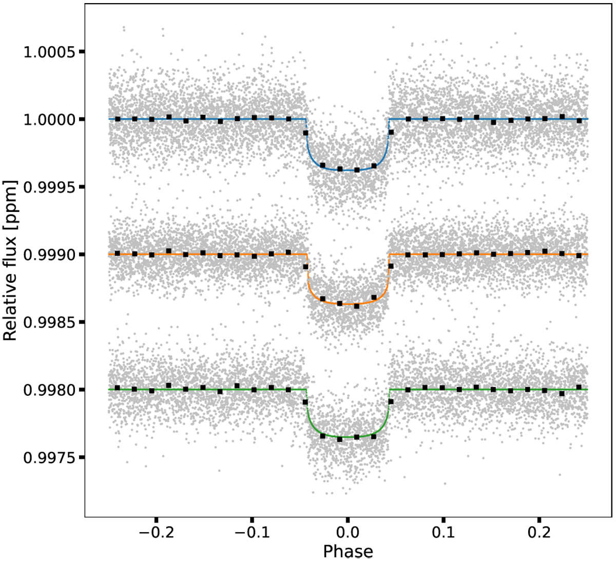
Phase-folded relative flux displaying the transit. The light curves were shifted down for clarity. The top light curve corresponds to sector 21, the middle light curve to sector 44, and the bottom to sector 46. Silver points are detrended flux measurements. The continuous lines show the transit model, where sector 21 is depicted in blue, sector 44 in orange, and sector 46 in green. We keep this convention for the rest of this work. Black squares represent binned data. We note that bins are for visualization and were not used in our analysis.
Current usage metrics show cumulative count of Article Views (full-text article views including HTML views, PDF and ePub downloads, according to the available data) and Abstracts Views on Vision4Press platform.
Data correspond to usage on the plateform after 2015. The current usage metrics is available 48-96 hours after online publication and is updated daily on week days.
Initial download of the metrics may take a while.