Fig. 3.
Download original image
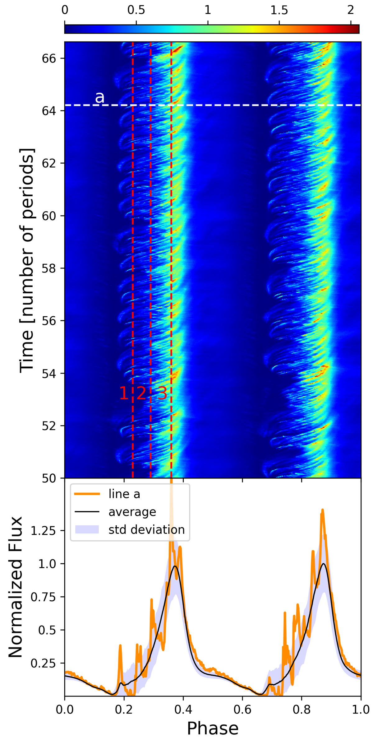
Synthetic synchrotron pulse profiles. Top: phase–time diagram of the synchrotron flux. Vertical red dashed lines numbered 1, 2, and 3 are different phases in the left caustic, Φ = 0.23, 0.29, and 0.36, respectively, and are used in the following figures. Bottom: pulse profile seen by a single observer (orange solid line) generated by crossing the phase–time diagram along the white dashed line labeled “a” in the upper panel. The black solid line shows the pulse profile averaged over times t ≥ 50Tspin. The blue shaded region is bounded by the mean flux which is augmented or diminished by the standard deviation to highlight the variable parts of the pulse profile.
Current usage metrics show cumulative count of Article Views (full-text article views including HTML views, PDF and ePub downloads, according to the available data) and Abstracts Views on Vision4Press platform.
Data correspond to usage on the plateform after 2015. The current usage metrics is available 48-96 hours after online publication and is updated daily on week days.
Initial download of the metrics may take a while.