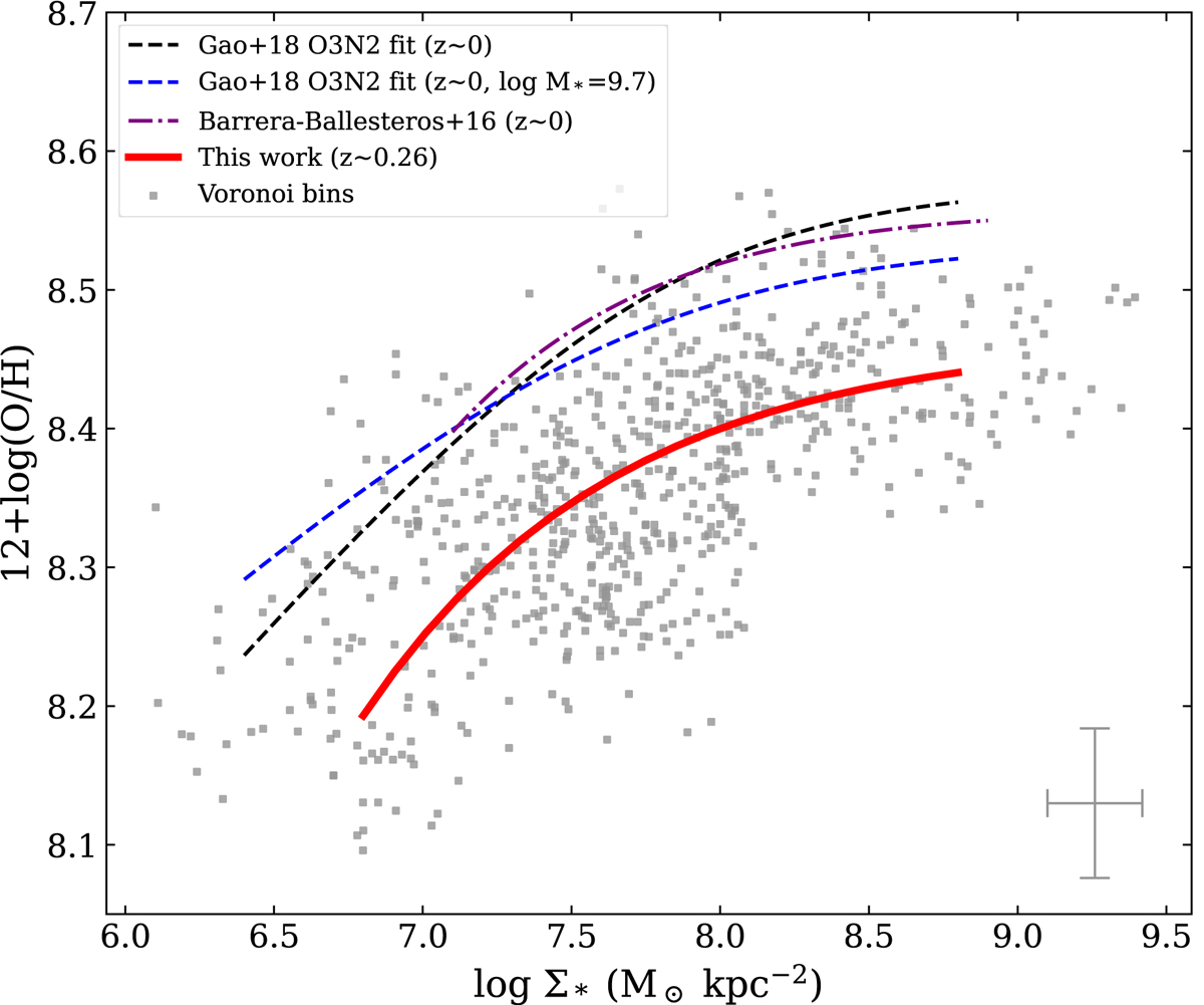
Fig. 5.
Download original image
rMZR of our sample compared with that of other works. The gray dots represent our bins, and the error bar in the lower right corner represents the average value of the uncertainty on each axis. The thick red curve represents the fit of all gray crosses. The dashed black curve comes from Gao et al. (2018b), the dashed blue curve is the fit from Gao et al. (2018b) at a fixed log M* = 9.7, and the dash-dotted purple curve comes from Barrera-Ballesteros et al. (2016). The dash-dotted purple curve is shifted by 0.24 dex to the left to correct for the systematic error caused by the IMF (Sánchez et al. 2016).
Current usage metrics show cumulative count of Article Views (full-text article views including HTML views, PDF and ePub downloads, according to the available data) and Abstracts Views on Vision4Press platform.
Data correspond to usage on the plateform after 2015. The current usage metrics is available 48-96 hours after online publication and is updated daily on week days.
Initial download of the metrics may take a while.