Fig. 3
Download original image
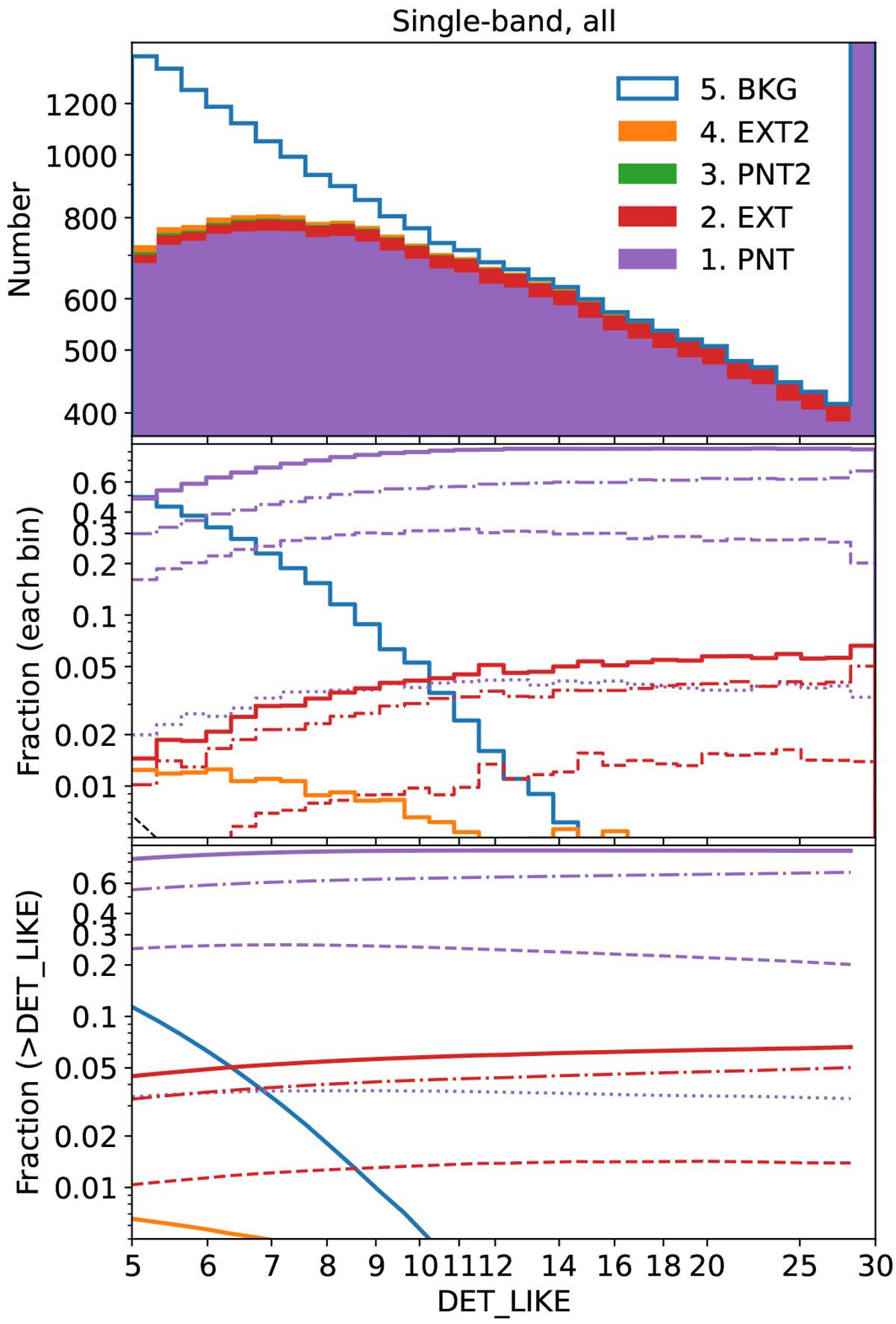
Distributions of all the single-band-detected sources as a function of detection likelihood. Purple, red, green, orange, and blue correspond to the five classes (1~5) of detected sources. The top, middle, and bottom panels display stacked histograms, differential fractions, and cumulative fractions, respectively. The dot-dashed, dashed, and dotted lines in purple and red indicate the three subclasses of no contamination, point-source contamination, and extended-source contamination, respectively. See Sect. 3.2 for details. The dashed black line indicates probability=exp(-likelihood). It is too low and almost drops out of the plotting scope of the middle panel.
Current usage metrics show cumulative count of Article Views (full-text article views including HTML views, PDF and ePub downloads, according to the available data) and Abstracts Views on Vision4Press platform.
Data correspond to usage on the plateform after 2015. The current usage metrics is available 48-96 hours after online publication and is updated daily on week days.
Initial download of the metrics may take a while.