Fig. 2
Download original image
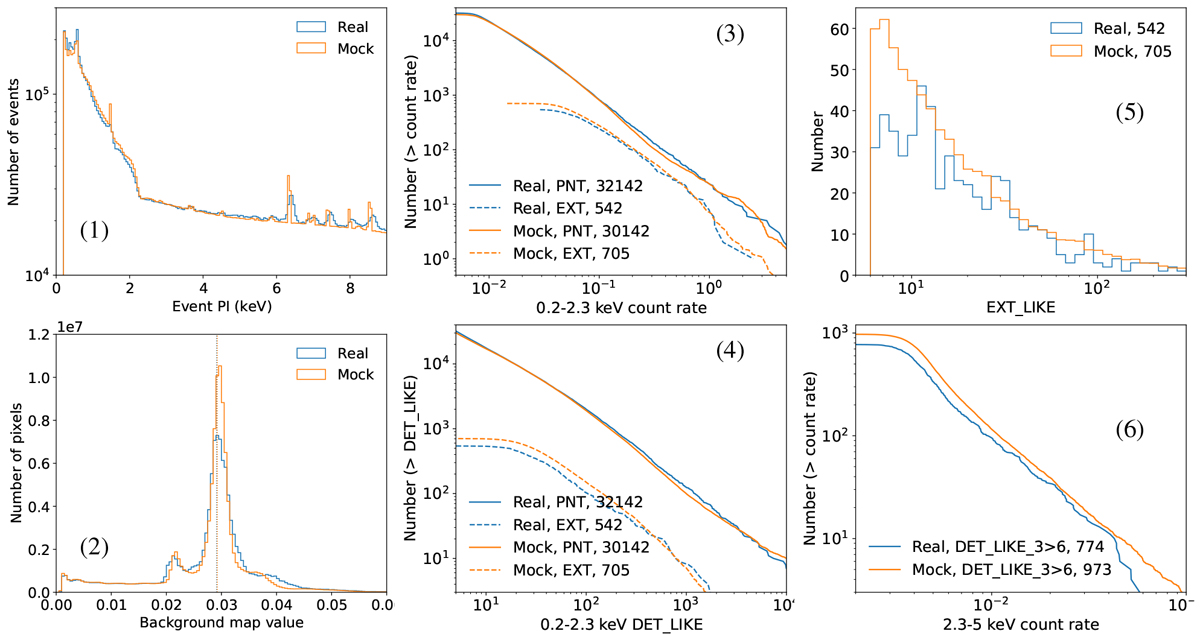
Comparisons between the real (blue) and the mock (orange) eFEDS data. Panel 1 compares the event PI (photon energy) distributions. Panel 2 compares the distributions of the 0.2–2.3 keV background map value (counts/pixel) in each pixel. The dotted vertical line corresponds to the median values of the two data sets, which are identical. Panels 3–4 display the total number of sources in the 0.2–2.3 keV single-band-detected catalog above a given count rate (panel 3) or above a given detection likelihood (DET_LIKE; panel 4) for point sources (“PNT”; EXT_LIKE=0; solid lines) and extended sources (“EXT”; EXT_LIKE>0; dashed lines), respectively. Panel 5 displays the extent likelihood (EXT_LIKE) distribution of the single-band-detected extended sources. Panel 6 displays the 2.3–5 keV (band 3) count rate of sources that are detected in this band (DET_LIKE_3 > 6) from the three-band detection. The number of sources is printed in the label of each entry.
Current usage metrics show cumulative count of Article Views (full-text article views including HTML views, PDF and ePub downloads, according to the available data) and Abstracts Views on Vision4Press platform.
Data correspond to usage on the plateform after 2015. The current usage metrics is available 48-96 hours after online publication and is updated daily on week days.
Initial download of the metrics may take a while.