Fig. 6.
Download original image
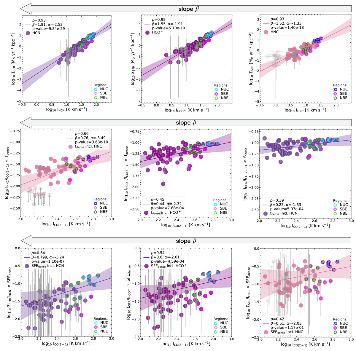
Correlation plots ordered by their slope, β. Dark purple colours show HCN, purple HCO+ and pink HNC. Top row: integrated intensities of the dense gas tracers (ordered by their slope, β) versus ΣSFR. Middle row: integrated intensity of CO(2−1) – an indicator of the mean volume density – versus the line ratio with CO(2−1) – a spectroscopic tracers of fdense. Bottom row: integrated intensity of CO(2−1) – an indicator of the mean volume density – versus the ratio of ΣSFR with the dense gas tracers – a spectroscopic tracers of SFEdense. The linmix fits (accounting for upper limits) are shown as solid lines surrounded by 3σ confidence intervals (shaded regions of corresponding colours). Absolute uncertainties are plotted on each data point, which are generally small towards the regions NUC, NBE and SBE. We find the highest uncertainties in the outskirts in our ΣSFR map. Correlations including HNC result in 58 significant sight lines and 15 upper limits (denoted as light pink markers). We display in each panel Pearson’s correlation coefficient and the power-law slope, intercept and p-value (see Table 6).
Current usage metrics show cumulative count of Article Views (full-text article views including HTML views, PDF and ePub downloads, according to the available data) and Abstracts Views on Vision4Press platform.
Data correspond to usage on the plateform after 2015. The current usage metrics is available 48-96 hours after online publication and is updated daily on week days.
Initial download of the metrics may take a while.