Fig. 6.
Download original image
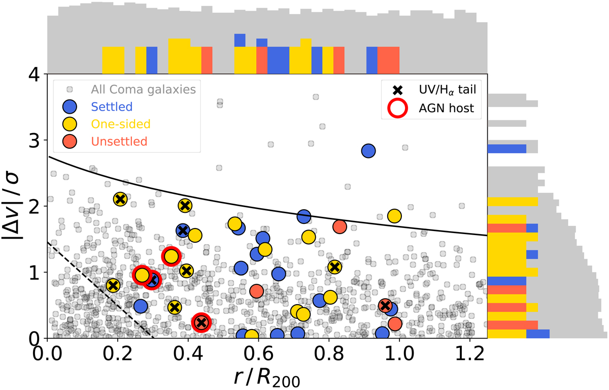
Phase-space diagram of the Coma cluster. Red, yellow, and blue circles mark our H I detections, while grey circles represent the underlying distribution of all spectroscopically confirmed Coma sources from Healy et al. (2021). Logarithmic histograms of appropriate colour along the horizontal and vertical axes show the marginalised distributions of cluster centre distance and line-of-sight velocities, respectively. The dashed line is drawn at the upper boundary of the statistically most virialised galaxy population from Eqs. (3) and (4) of Pasquali et al. (2019) using p = 1. The black curve is the cluster escape velocity as a function of distance from the centre, calculated via Eq. (2) of Jaffé et al. (2015). The black crosses highlight sources with UV (Smith et al. 2010) and/or Hα (Yagi et al. 2010) tails. Finally, the red circles indicate galaxies identified as AGN in previous literature (Mahajan et al. 2010; Gavazzi et al. 2011; Toba et al. 2014).
Current usage metrics show cumulative count of Article Views (full-text article views including HTML views, PDF and ePub downloads, according to the available data) and Abstracts Views on Vision4Press platform.
Data correspond to usage on the plateform after 2015. The current usage metrics is available 48-96 hours after online publication and is updated daily on week days.
Initial download of the metrics may take a while.