Fig. 6.
Download original image
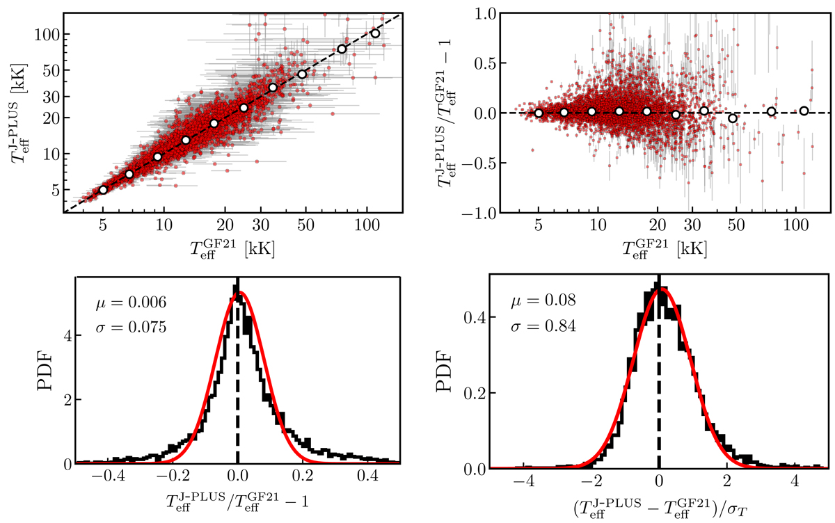
Comparison between the effective temperature derived from J-PLUS (![]() ) and Gaia EDR3 (
) and Gaia EDR3 (![]() ) photometry. Top left panel: individual measurements (red dots) with gray error bars. The median in ten temperature intervals is marked with the white dots. Dashed line marks the one-to-one relation. Top right panel: relative difference between J-PLUS and Gaia temperatures as a function of Gaia temperature. White dots show the median difference in ten temperature intervals. Dashed line depicts identity. Bottom left panel: histogram of the relative difference. Bottom right panel: histogram of the error-normalised difference between J-PLUS and Gaia temperatures. In both bottom panels, the red line shows the best Gaussian fit to the distribution, with parameters labeled in the panel.
) photometry. Top left panel: individual measurements (red dots) with gray error bars. The median in ten temperature intervals is marked with the white dots. Dashed line marks the one-to-one relation. Top right panel: relative difference between J-PLUS and Gaia temperatures as a function of Gaia temperature. White dots show the median difference in ten temperature intervals. Dashed line depicts identity. Bottom left panel: histogram of the relative difference. Bottom right panel: histogram of the error-normalised difference between J-PLUS and Gaia temperatures. In both bottom panels, the red line shows the best Gaussian fit to the distribution, with parameters labeled in the panel.
Current usage metrics show cumulative count of Article Views (full-text article views including HTML views, PDF and ePub downloads, according to the available data) and Abstracts Views on Vision4Press platform.
Data correspond to usage on the plateform after 2015. The current usage metrics is available 48-96 hours after online publication and is updated daily on week days.
Initial download of the metrics may take a while.